T he primary logo features a dis�nguished golden shield with refined metallic edges. The shield serves as an emblem of strength, symbolizing the unwavering stability of our esteemed brand. Posi�oned prominently at the center is the le�er "K" rendered in pris�ne white. This symbolic le�er "K" represents Karapetyan's core brand iden�ty, encompassing a diverse array of products, including the GILDIA. Subsequent sec�ons of this guideline will delve into the comprehensive details of the GILDIA and its elements. The preferred posi�on of this logo is in the middle of the top.
The le�er "K" embodies the dis�nguished insignia of Karapetyan's brand group.
The K shaped can be used as the sole iden�fier for the brand in instances where the brand is well established, or within an environment where there are sufficient examples of full brand iden�ty and therefore the symbol will be easily recognized
BRANDMARK
DO NOT ALTER THE COLOR, CONFIGURATION, ELEMENTS OR PROPORTIONS OF THE LOGO IN ANY WAY.
MINIMUM SIZES & CLEAR SPACE AREA
There is a minimum size for the GILDIA brandmark.
No brandmark should ever appear smaller than its respec�ve minimum size.
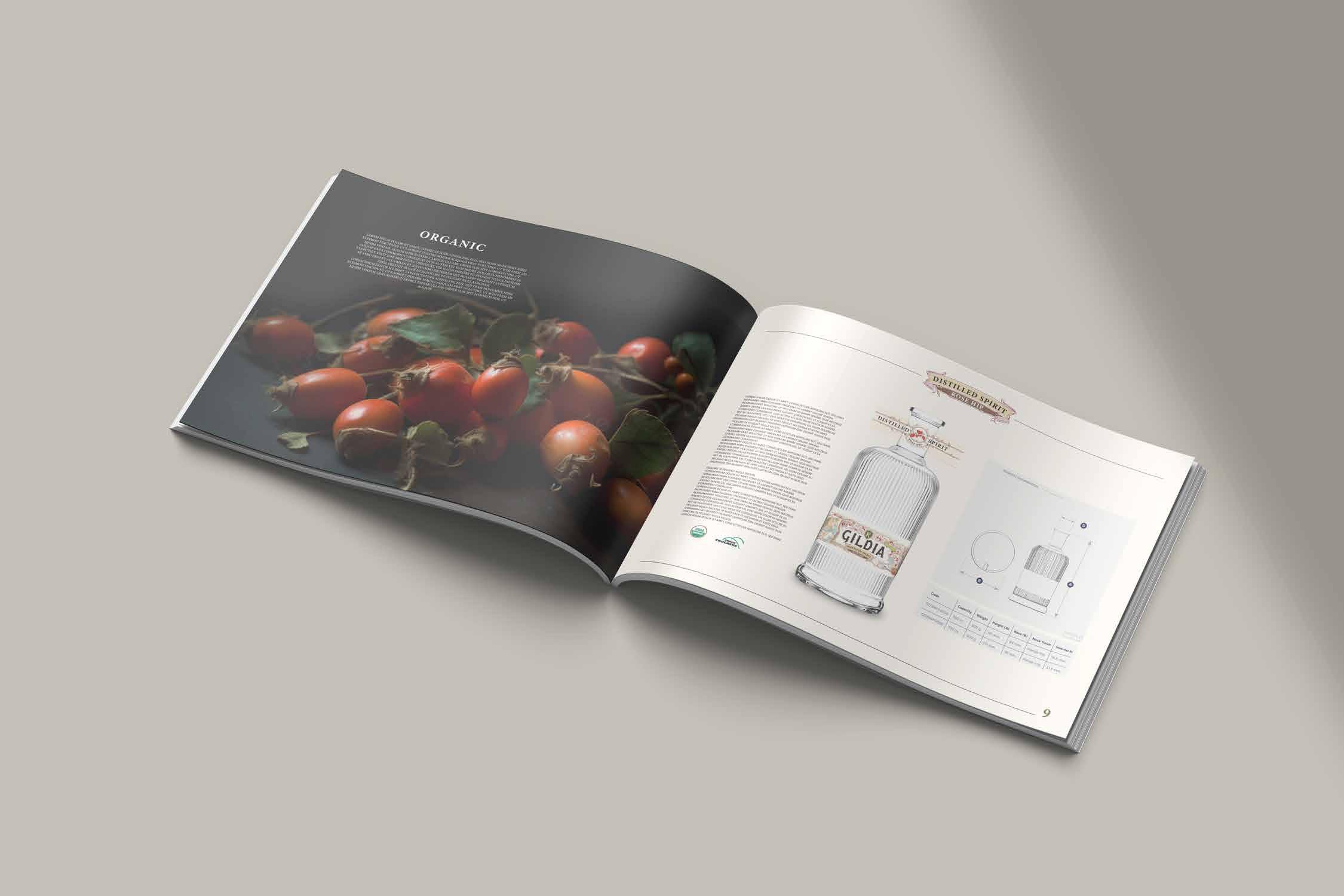
The brandmark size on the label 0.93cm
The brandmark must always stand out prominently and not be crowded by any graphic, pa�ern or typography. It should have as much clear space around it as possible.
brandmark clear space area
The marque minimum clear space area is equa of the cube.
Minimum size : 0.5cm
The brand mark should always be prominently featured on all packaging materials. It is essen�al to display the brand mark as a dis�nct symbol rather than in its full name.
NAME DESCRIPTION
The term “guild” denotes a group of individuals who unite to offer each other mutual support, coopera�on, and protec�on in a specific cra�. These guilds have a rich history, da�ng back to medieval �mes, and were prominent in Europe and Asia. Although their significance has waned over �me, some modern versions of guilds s�ll exist in certain professions and industries.
The philosophy of guilds revolves around several core principles: emphasizing skill development and exper�se, fostering a sense of community and assistance among members, upholding high ethical standards to ensure fairness and maintain the cra�'s reputa�on, and func�oning as collec�ve bargaining units to advocate for their members.
Considering the alignment of our company vision with these principles, we have chosen to name our product ” GILDIA ” assuming the responsibility that comes with the significance of this name.
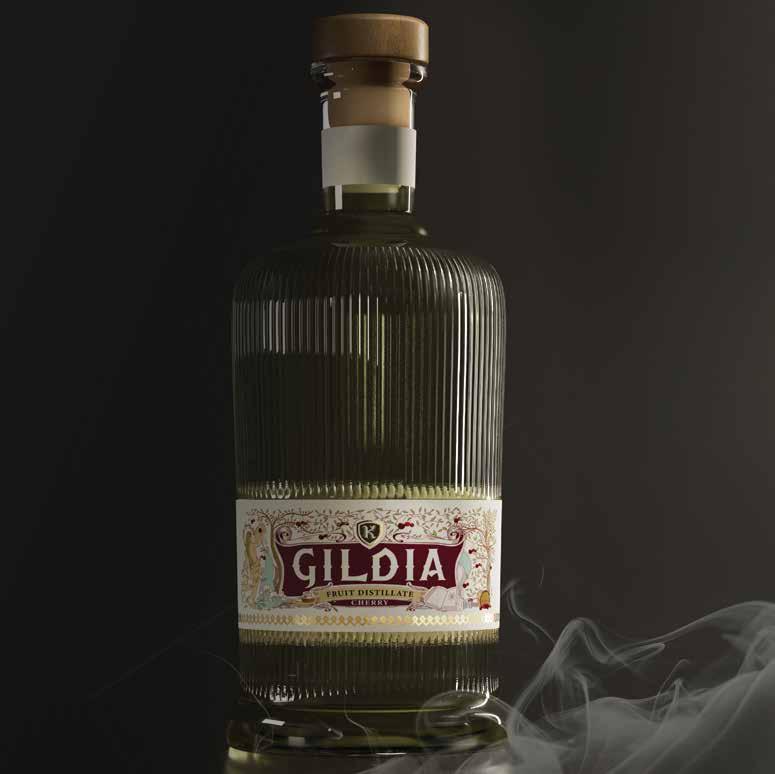
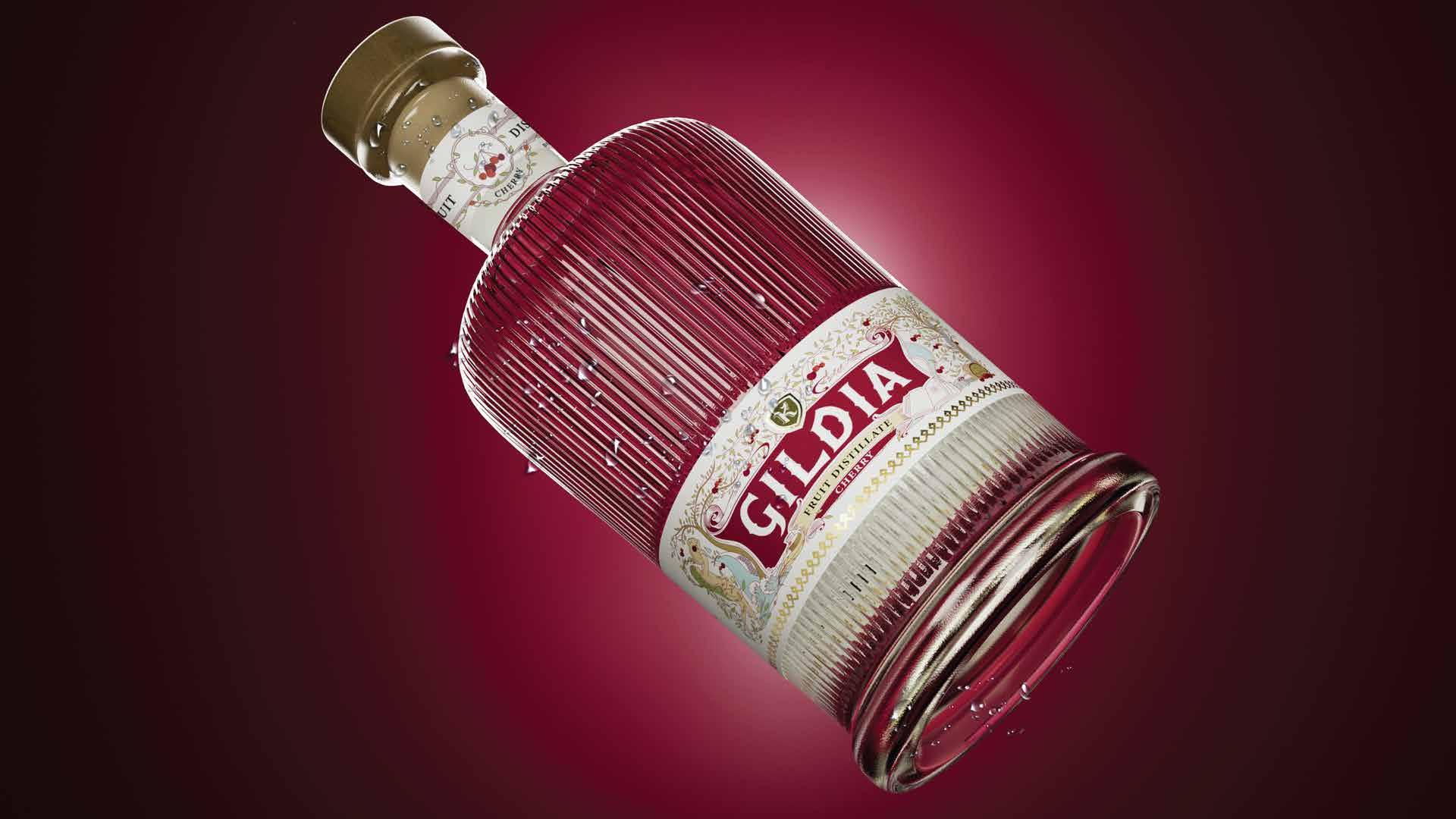
"GILDIA" is an exquisitely hand-cra�ed font though�ully designed to embody and enrich the essence of our legend. The font showcases an elegant Gothic style, me�culously chosen to harmonize with the cap�va�ng atmosphere of the narra�ve.
This dis�nguished wri�ng serves as the paramount focal point, holding a pivotal role in our label's view. Rendered exclusively in black, each le�er is tastefully adorned with delicate golden lines, impar�ng a sense of completeness to the typography while accentua�ng its overall stylis�c allure.
When incorpora�ng the vodka name "GILDIA" within text, it is of utmost importance to maintain a consistent tone of voice and expression throughout all communica�ons.
Furthermore, when referencing the vodka "GILDIA" in the English version, the name should always be rendered in capital le�ers to reinforce its visual impact and brand recogni�on. Adhering to these precise guidelines ensures a cohesive and professional representa�on of our esteemed brand in various contexts.
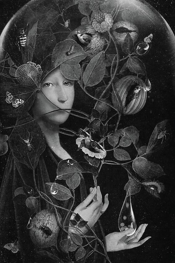
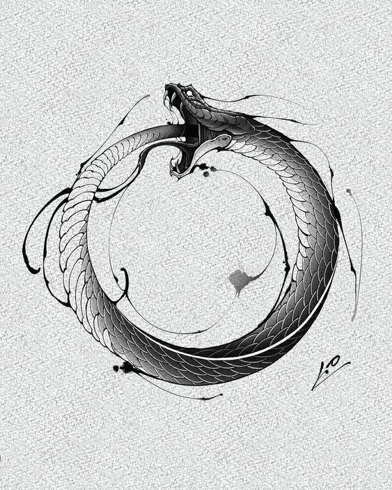
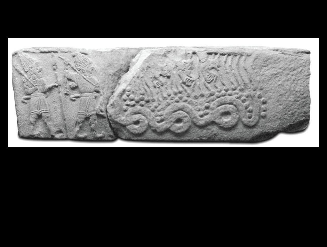
In ancient Armenian legends, the dragon held a significant posi�on as the guardian of gardens. It roamed through the gardens, crea�ng water pathways with its tail, thereby fostering the gardens’ produc�vity and abundance.
This mythical creature, the dragon, serves as a powerful symbol on our label, represen�ng not only its role as a garden ruler but also its essence as a bearer of knowledge across genera�ons. Depicted on the label, the dragon is seen nourishing and impar�ng its wisdom to three birds, symbolizing the act of transmi�ng informa�on to the offspring.
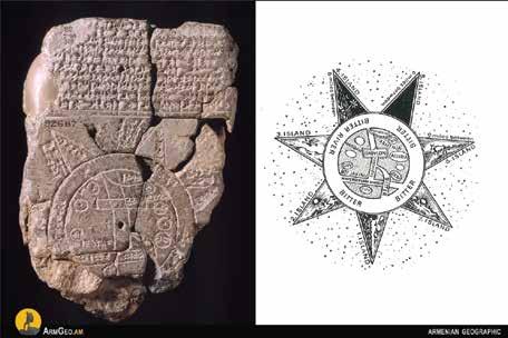
Addi�onally, the label features another element of importance, the book, subtly connected to the inkwell and quill. This book symbolizes the recording and dissemina�on of vital informa�on concerning the Guild. In the book one can see an ancient Babylonian map where Armenia is men�oned for the first �me, further emphasizing the rich heritage and significance of our brand.
In ancient Armenian legends, the dragon held a significant posi�on as the guardian of gardens. It roamed through the gardens, crea�ng water pathways with its tail, thereby fostering the gardens’ produc�vity and abundance.
This mythical creature, the dragon, serves as a powerful symbol on our label, represen�ng not only its role as a garden ruler but also its essence as a bearer of knowledge across genera�ons. Depicted on the label, the dragon is seen nourishing and impar�ng its wisdom to three birds, symbolizing the act of transmi�ng informa�on to the offspring.
TYPEFACE
The gildia primary typeface is a minion “variable concept” It is important to u�lise and adhere to the same font throughout all our communica�on material, thereby ensuring and maintaining consistency across the brand. Never distort, expand or condense our primary typeface in any way.
DIGITAL TYPEFACE
C alibri
Calibri has been chosen for our digital typeface, to be used for all our online needs.Calibri is a system font meaning that any computer will be able to load and display it. This means that any online content should be consistent whatever screen it appears on.