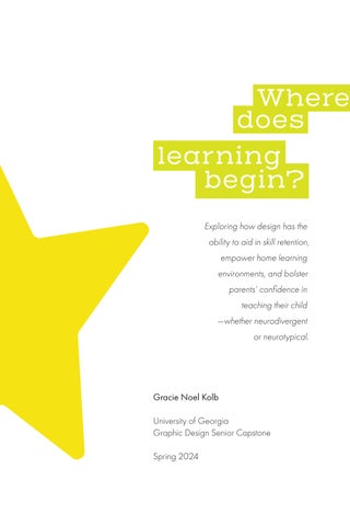
Where does begin? lear ning
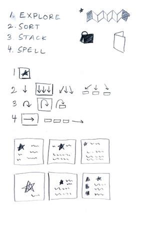
Exploring how design has the ability to aid in skill retention, empower home learning environments, and bolster parents’ confidence in teaching their child —whether neurodivergent or neurotypical.
Gracie Noel Kolb
University of Georgia
Graphic Design Senior Capstone
Spring 2024
Introduce 04 Brainstorm 10 Inquiry 12 Define Research 16 Secondary 18 Primary 24 Summary Ideate 28 Mood Board 29 Initial Sketches Execute 34 Methodology 35 Physical 40 Digital Document 48 Final Deliverables Reflect 56 Concluding Thoughts 58 Acknowledgments Table of Contents
Introduce
2
What do I care about and how can I translate those interests into
a design inquiry?
3
In order to frame a problem and point of inquiry, I first had to do some brainstorming.
I began a freewriting exercise with the intention of generating a wide range of ideas without any constraints or expectations. The prompts I followed included:
Reflect on the work I have completed thus far. What has taught me the most, and why?
Where do I want to go next?
What am I thinking about outside of design?
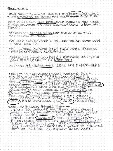
4
After answering these questions, I took some time to pinpoint recurring themes; these are my findings:
I contemplate the act of observation. My attention to detail surpasses that of many. I reflect on people and their collective experiences, valuing both their individual journeys and shared moments. The well-being of others holds significance to me, and I am driven by the desire to positively impact at least one life. I focus on the significance of small wins and am committed to persevering rather than succumbing to defeat easily. I’ve come to value the act of exploration and embracing the risks that often lead to beautiful outcomes. I cherish the process itself, recognizing that it shapes my identity as an imperfect yet unique individual, imbued with inherent worth.
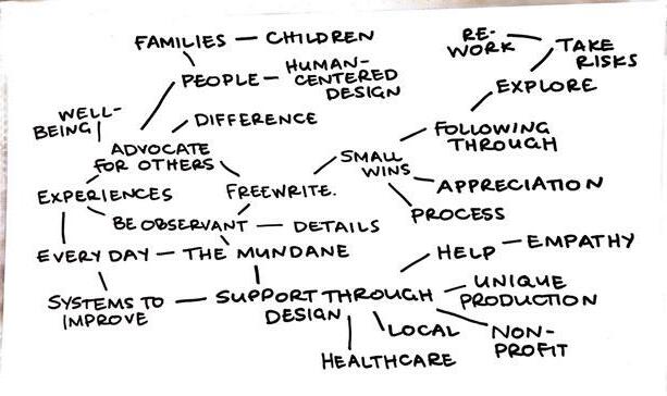
I explored a much wider scope of the freewrite using a mind mapping exercise.
I quickly plotted out some associated key words.
5
Then came the lenses.
Translation, Inclusion, Advocacy, Collaboration
I used a few words to define each lens.
Advocacy: voice, awareness, empathy
Collaboration: communication, fill gaps, people-centered
Inclusion: understanding, connection, diversity
Translation: perspective, adaptation, accessibility
How might the themes explored in the freewrite exercise align to one of these four lenses?
6
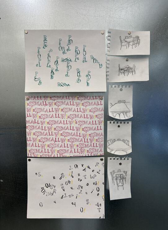
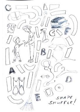
I started to visualize some of the themes and lenses.
I retrieved a collection of letterform stamps to convey the themes through typography. I also chose an object and drew it from multiple perspectives to see how I could associate a physical object to a broad topic, specifically the lenses. I selected a table because I perceived it as a space that could relate to all of the lenses, serving as a gathering place for people.
7
The central question in linking these themes to a lens was about identifying the intended audience. Whom did I aim to engage with?
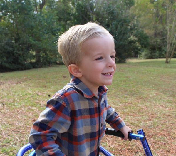
One particular little boy crossed my mind—my nephew.
My nephew faces challenges with fine motor skills and verbal communication. Starting school marks a significant transition, not just for him but also for his parents. While they’ve been deeply involved in his development thus far, they now must entrust him to the education system. I’m curious about this transition—how the skills he’s acquired at home will translate to the new environment and curriculum. What kind of stress does this put on parents to make sure their child is “prepared“ for the transition?
8
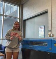
Everyone, meet Finley!
9
I began my inquiry with some preliminary research.
I started off by looking into designing a tool for young children with learning disabilities.
I quickly realized just how diverse these disabilities are, making it nearly impossible to meet every child’s unique needs. This deepened my understanding of the great challenge this can be on the child as well as the parent. Digging deeper, I noticed a great deal of stigma surrounding this issue, especially when it comes to the relationship between parents and their disabled child.
It became apparent that my audience was splitting between now two parties, the child themselves and the parent or caregiver. Consequently, I wondered how I could effectively target both users who navigate a shared challenge.
10
Furthering my inquiry into learning milestones for young children, I recognized a recurring set of expectations for those around the same age as my nephew:
Age 3–4: Letter Recognition
Age 4–5: Handwriting
I pondered whether these expectations adequately account for the diverse learning paces of all children. Do these expectations become imposed on children upon entering preschool? What strategies are employed to help children transition smoothly into a new learning environment and curriculum? Given the significant transition, are there initiatives in place to alleviate some of the stress on parents and caregivers at this stage as well?
11
Now I’ve got it.
From preliminary research, I located my point of inquiry, or my capstone statement.
Teaching children with learning disabilities can be daunting for parents and caregivers, who often are unsure where to begin amidst societal expectations and stigma.¹ Each child has unique learning needs and research highlights the difficulty in accessing appropriate resources. The foundation skill of letter learning, pivotal for early literacy development, begins with recognition and progresses to handwriting proficiency, typically early in preschool.² During my research, I observed a disconnect between a precursor skill, spatial awareness, and letter recognition, prompting me to contemplate the potential benefits of a more holistic approach. My goal then quickly shifted towards translating these skills into a single learning instrument through design. This instrument, tactile and interactive in nature, will utilize wooden letter cutouts intended for separation and reassembly, facilitated by magnets. It will allow parents to harness their child’s existing understanding of spatial relationships to introduce letter learning in a home setting, catering to various learning styles and educational needs as well as individual learning paces. Ultimately, the objective is to aid in skill retention, empower home learning environments, and bolster parents’ confidence in teaching their child—whether neurodivergent or neurotypical.
12
¹ Amy Julia Becker wrote in The Atlantic, “On learning their fetus could have this intellectual disability, between seventy and eighty-five percent of pregnant women in the US choose abortion.
² Brightwheel, a company that believes in high quality education for every child, suggests, “Early literacy development refers to everything that children learn as they get ready to read and write. Early literacy skills include vocabulary building, playing with the sounds of language through things like songs, learning how to hold books, learning to write through drawing and scribbling, and understanding letter-sound connections. Learning the alphabet supports these early literacy skills and establishes a strong foundation for literacy development.”
13
14
Research
Has there been any previous investigation into this topic, and what further resources can I explore independently?
15
Secondary research was up first.
According to the Learning Disabilities Association of America,
“Often the child’s teacher will notice the first symptoms of a Specific Learning Disability. Parents may also notice symptoms that are different from those the teacher sees. That’s why it is so important for teacher and parents to share notes on the development of a child.”
A public author manuscript from the Department of Health and Human Sciences read,
“Developmental relations between young children’s letter recognition and their 3-dimensional object recognition abilities are implicated on several grounds but have received little research attention.”
The results from the study completed suggested,
“...letter recognition builds upon developing skills in attending to and representing the relational structure of object shape.”
Augustine, E., Jones, S. S., Smith, L. B., & Longfield, E. (2015). Relations Among Early Object Recognition Skills: Objects and Letters. Journal of Cognition and Development, 16(2), 221–235. https://doi.org/10.1080/15248372.2013.815620
16
Bill Gates has both dyslexia and ADHD and has openly spoken about his struggles with mainstream education.
“Incremental knowledge is so much easier to maintain in a rich way.”
Gates is emphasizing the importance of taking a gradual, systematic approach to learning and knowledge acquisition, which ultimately leads to a richer and more sustainable understanding of the subject matter. Basically, each new piece of information is built upon what is already known; it is more manageable and less daunting in the long run. Learning is a marathon, not a sprint. Trying to absorb too much information too quickly is like attempting to sprint the entire marathon—it’s exhausting and unsustainable.
According to the CDC,
“Research shows that early intervention services can greatly improve a child’s development.”
According to the National Center for Education Statistics,
“In 2021–22, the number of students ages 3–21 who received special education and/or related services under the Individuals with Disabilities Education Act (IDEA) was 7.3 million, or the equivalent of 15 percent of all public-school students. Among students receiving special education and/or related services, the most common category of disability was specific learning disabilities (32 percent).”
17
Primary research followed.
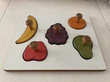
I investigated what the current market looks like for spatial awareness and letter learning.
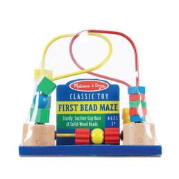


These are among the most prevalent products Idiscovered when searching for tools to develop those specific skills.
The transition between these two tools is non-existent. They are treated as separate skills, whereas learning should be viewed as a continuous process that builds upon previous knowledge, particularly for children who may not grasp concepts as easily.
A common link between these two, however, is tangibility. I observed the significance of a hands-on experience for early learners. I also recognized that texture and colors can significantly impact experience.
18
Dr. Megan Anna Neff, AuDHD Psychologist suggests, “Around 15-20% of the population is born with a temperament that makes them highly sensitive to their environment.”
I found that wood is considered the best material for toys, despite the strong prevalence of plastic toys on the market.
An article from the National Library of Medicine says, “Tactile stimulation by touching wood with the palm is considered to bring about physiological relaxation effects because wood is a familiar and representative natural material for humans.”
Ikei, H., Song, C., & Miyazaki, Y. (2017). Physiological Effects of Touching Wood. International journal of environmental research and public health, 14(7), 801. https://doi. org/10.3390/ijerph14070801
Maria Montessori, a highly esteemed Italian physician and educator, favored toys made of natural materials like wood because they are considered healthy, safe, and inspiring for children.
And as for color, I found that bright colors can often be overstimulating, while soft and neutral colors can contribute to a more a positive experience.
Schrieber Center for Pediatric Development says it is beneficial to, “Reduce the amount of color contrasts in areas where children have to sustain attention to a task, such as classrooms or homework areas.”
19
To ensure the utmost intentionality in my final deliverable, I recognized the importance of exploring real human experiences. Watching my nephew and my sister navigate challenges associated with his learning disabilities, I realized that exploring the role of the caretaker was essential for a comprehensive understanding.
Interview 1, Larianne Walters
What is your child’s diagnosis?
“He is diagnosed with atresia of foramina of magendie and luschka, also known as Dandy-Walker Malformation, which caused hydrocephalus, posterior fossa cyst/arachnoid cyst, hypotonia, and localization-related focal epilepsy. Vermian hypoplasia also goes along with the DWM.”
What feelings did you have at the time of diagnosis?
“I was in shock. I felt grief from having a ‘normal’ child and increasing pregnancy stress. I was anxious because doctors could not really tell us anything more than what they saw on scans. We were basically given zero answers to our questions about the child we were about to have other than he would be ‘severely disabled’, verbatim from the radiologist. I experienced great sadness.”
20
What has your experience been like raising him thus far?
“I have noticed that many think disability is a bad word, but it’s not. It gives access. If his paperwork did not say he was disabled, the resources out there for him to succeed would not be accessible.”
“There is a lack of affordable adaptive products. I have found it helpful when other parents share cheaper alternatives for specific needs.”
“At places like CHOA, disabled kids are everywhere you look. It’s like walking into a world where disability is normal. No one stares, everyone waves.”
What has the education experience been like thus far?
“He started speech at 11 months. We were introduced to ‘total communication’ and encouraged to begin communication with ASL. It really made all the difference. He was able to express his needs through simple signs we learned together. He has mainly learned through repetition, sounds, and tracing. He connects shapes to meanings which has made it difficult for him to learn simple shapes.”
21
The most important part of my primary research was interacting with the potential user, my nephew.
During several play-dates, I made sure to be particularly observant. I noticed the toys he was attracted to and assessed their functionality, particularly whether they were accessible or inaccessible for him.
22
He was constantly drawn to his train set.
He struggled to put the train car on the tracks. The indention on the track for each wheel was less than a quarter inch wide.
His books never left the shelf.
This was very unusual and came to my surprise. He typically pulls every book off the shelf, but these particular play-dates, he was interested in other toys.
He showed a greater interest in engaging with hands-on activities rather than watching television.
23
Now to sum it all up.
We must address the gap between spatial awareness and letter learning.
It’s probable that people are unaware of the true prevalence of disability.
24
We’re in need of affordable learning materials, particularly those that are accessible for children with disabilities.
The user should always be central to the decision-making process.
25
Ideate
26
How do I take this information and visualize it?
27
Now
to find some inspiration.
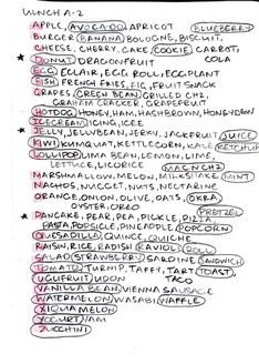
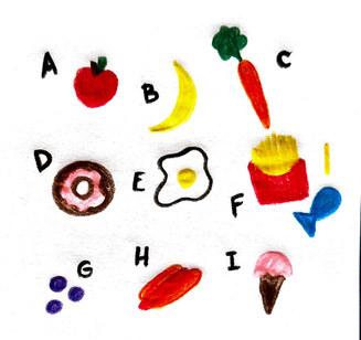
I began collecting images of color, form, and type.
My search included keywords such as “slab, sans, geometric, figure-ground relationship, wood, puzzles, grid, and dynamic”.
28
I did some quick sketching to get my brain moving in the right direction.
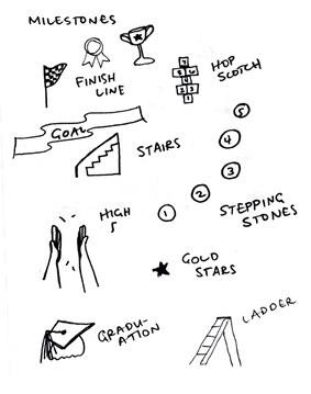
I directed my sketching towards shapes, letters, educational elements, and milestones.

29
The sketching continued.
This time, my focus was on form, accompanied by some illustrative work.
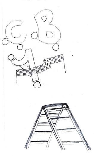
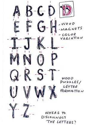
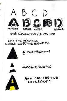
I investigated the optimal method for letter separation. Initially, I attempted to isolate them based on individual strokes, but this approach didn’t yield a universally applicable separation for each letter. While letters with vertical and horizontal strokes showed similarities, those with curved strokes presented a challenge in achieving a consistent separation. This prompted me to explore an alternate approach. What if the negative space was the separation? After all, that is what gives a letter its identity.
30
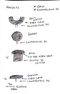
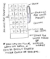
To address the coordination issue uncovered during research, it was important to consider accessibility. How could I approach the concept for better tactile feedback.
I observed that some wooden puzzles had handles to aid grip, yet the issue of proper placement persisted. To address this, I considered how to guide the user’s hand to the correct position. This is where the idea of incorporating magnets became relevant.
Additionally, I sought to explore a theme based on my research indicating that children frequently establish connections between shapes and familiar objects or specific meanings.
31
Execute
32
How do I initiate the process of turning this concept into a tangible product?
33
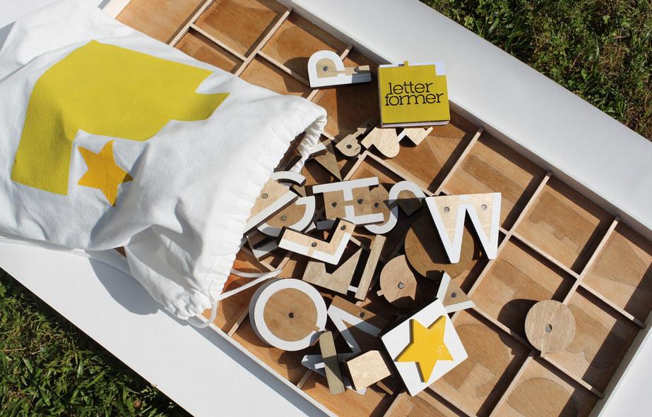
Time to make.
Here’s the plan.
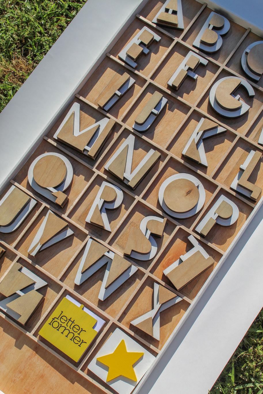
I’ll focus on uppercase letters since that’s where children typically begin.
I’ll use wood for construction and magnets as additional hardware.
I’ll paint the letters cohesively.
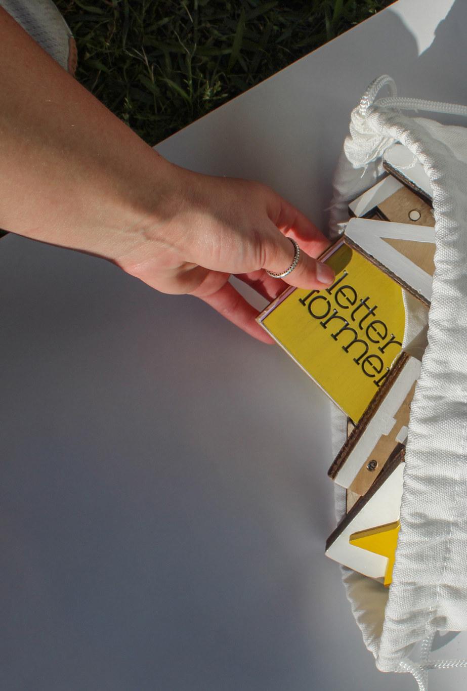
I’ll need something to package the letters and a simple brand identity to identify the tool itself.
I’ll finally require a guide that demonstrates how to interact with this tool.
34
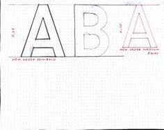
Using the typeface, New Order, I began.
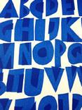
Understanding that letter learning can be challenging, I chose to opt for a geometric sans serif typeface for its simplicity and ease of recognition. By utilizing simple shapes, I aim to create a uniform and easily understandable visual experience for the learner.
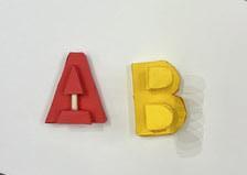
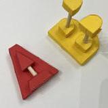
Using construction paper, I carefully constructed the letters “A” and “B”.
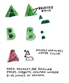
This provided me with the opportunity to explore scale and observe the interplay of colors. The dimensions of these letters were approximately 3 1/4 by 2 1/2 inches. However, I noticed that the scale of some pieces posed a choking hazard. My plan originally was to utilize a handle but I found that it compromised the visual identity of the letter itself. This prompted me to quickly find a solution to these issues. The smaller pieces could be eliminated if I connected them with another piece, and the handle could be eliminated if I just adjust the thickness of the wood. I would also need to carefully consider my color choices to ensure that the connecting piece doesn’t become a distracting element.
35
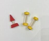
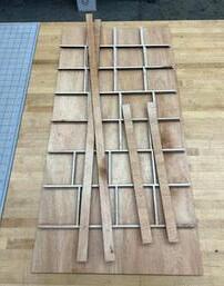
I gathered materials.
I purchased a set of acrylic paint, 1/2 inch birch plywood, 1/4 inch lauan plywood, and multiple sizes of magnets.
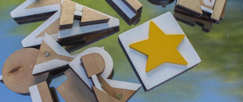
I created the first Illustrator file.
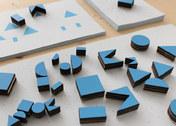
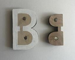
I designed the letters with a cap height of 3 1/4 inches, carefully utilizing grid lines to delineate the most practical space around each letter for easy identification. To maintain consistent separation across all letters, I followed a clear guideline: each separated piece needed to retain some degree of individual recognition. Whenever a letter required division into more than two pieces, I incorporated a 1/4 inch wide connecting stroke. This would eliminate the small pieces and mitigate the choking hazard. I extended these additional strokes to all other letter forms to create a unified appearance.
36
I sanded, drilled, glued, and painted.
Careful sanding was necessary to prep the edges of the letters, ensuring a smooth finish and eliminating any sharp edges or risk of splinters. I used a 1/2 inch drill bit to make pocket holes for the magnets to lay flush inside the face of each piece. Using E6000, I glued the magnets in the holes. I explored painting some of the letters with illustrations to assist users connecting familiar objects to the letter itself but, to create a more simplified user experience, I resorted to painting all of the letters white. I deliberately left the space where the magnet connects unpainted to help the user identify which piece belongs.
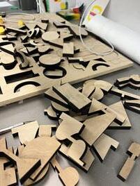
37
I laser cut.
I did some ideation for packaging once I constructed the letters.
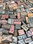
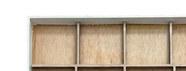
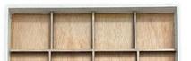
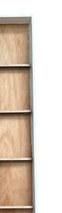
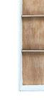
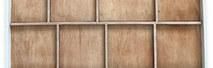
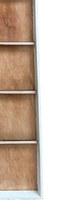
I drew inspiration from the organizing system reminiscent of the drawers for storing wood type for letterpress printing.
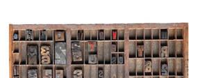
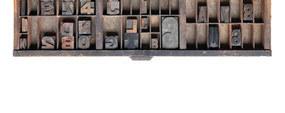
I created another Illustrator file.
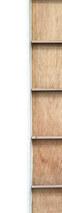
Each box of the inside grid maintained a consistent height, but their widths had to accommodate the different letter sizes. Letters such as M, Q, and W had a broader width, while those like I, V, and L were more narrow. Achieving a uniform appearance required precise adjustments to the measurements of each individual space. I measured for the back board and side walls leaving some extra space at the bottom for loose pieces.
38
I sanded, assembled, and painted again.
Once more, sanding played a crucial role in achieving a smooth finish. During assembly, I neglected to anticipate the wood glue drying with a yellowish tint, prompting me to swiftly devise a solution to conceal this imperfection. Carefully, I painted the frame with the same acrylic paint utilized on the letter forms.
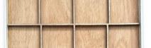
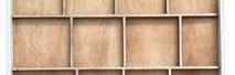
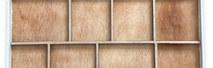
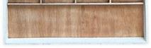
To finish off both the letter forms and the organizing system, I sprayed each with a coat of sealer.
39 I laser
cut again.
Now for some digital work.
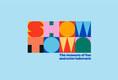
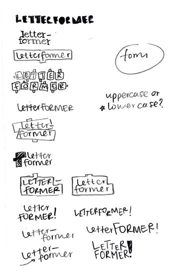
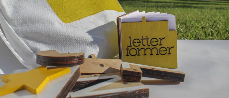
I decided on the name “Letterformer”.
I sifted through many options but I chose this because “letterform” denotes the distinct shape of each letter. By adding “er” to the end, the word “former” signifies someone, or something who shapes and creates.
I wanted the logo to be simple and highlight form. I worked on a few possible iterations.
40
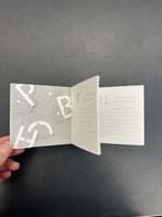
I opted for lowercase characters to contrast with the uppercase tangibles, while employing a slab serif typeface to mirror their structural characteristics.
I enclosed the text within a shape reminiscent of one of the wooden pieces, and incorporated a star shape to reference back to the milestones I previously explored.
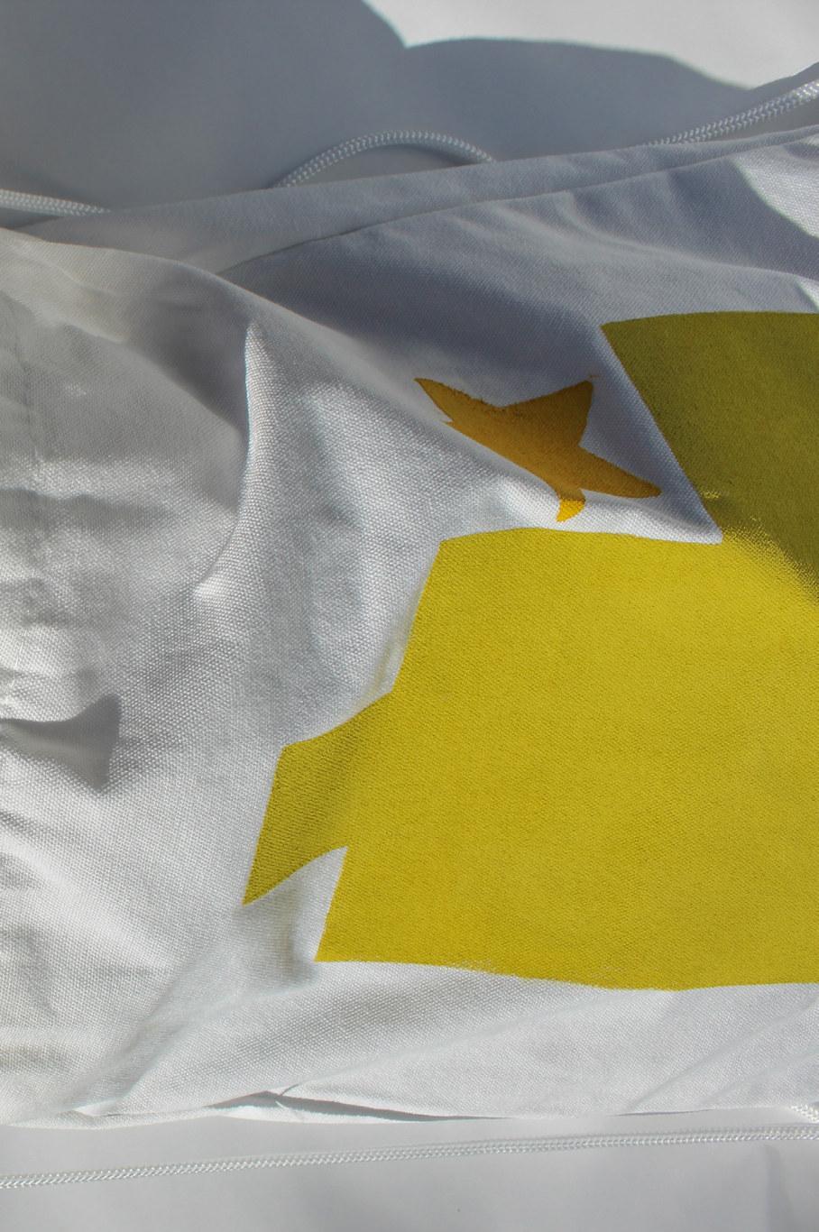
I chose soft colors to reflect my research on how color influences experiences. The primary colors are yellow and green, with yellow often associated with joy and green symbolizing growth. The secondary colors are pink and blue, with pink often linked to gentleness and blue symbolizing support.
41
The logo:
The primary palette: Secondary:
typeface:
42
BasicExtraLight ABCDEFGHIJKL MNOPQRSTUVWXYZ abcdefghijkl mnopqrstuvwxyz 1234567890
The
Henderson Slab
#D9E021 #EEC1C6 #F6E215 #98CEE8
Logo variations:
Application:
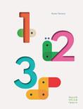
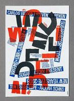
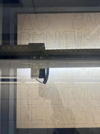
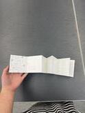
W here doe s
lea r ning
begin?
Research shows that, too of ten, many are unsure of where to begin.
“Letterformer” stands out as the only learning tool capable of translating acquired skills into new ones seamlessly, fostering a more comprehensive first step towards early literacy
43
The last element I needed was a set of instructions for the parent or caregiver teaching the child.
I let my nephew and his mother sit down to explore the tangible product I had created, allowing me to determine what should be included in the guide.
From my observations, it was clear that the child benefits from having the opportunity to sit and explore with the tool, enabling them to fully comprehend the shapes and how they interact. Additionally, it’s important for me to inform the parent about the correlation between specific shapes and corresponding skills, as well as the recommended starting point to facilitate the skill progression I aim for.
I drew inspiration from this research and sketched some ideas.
44
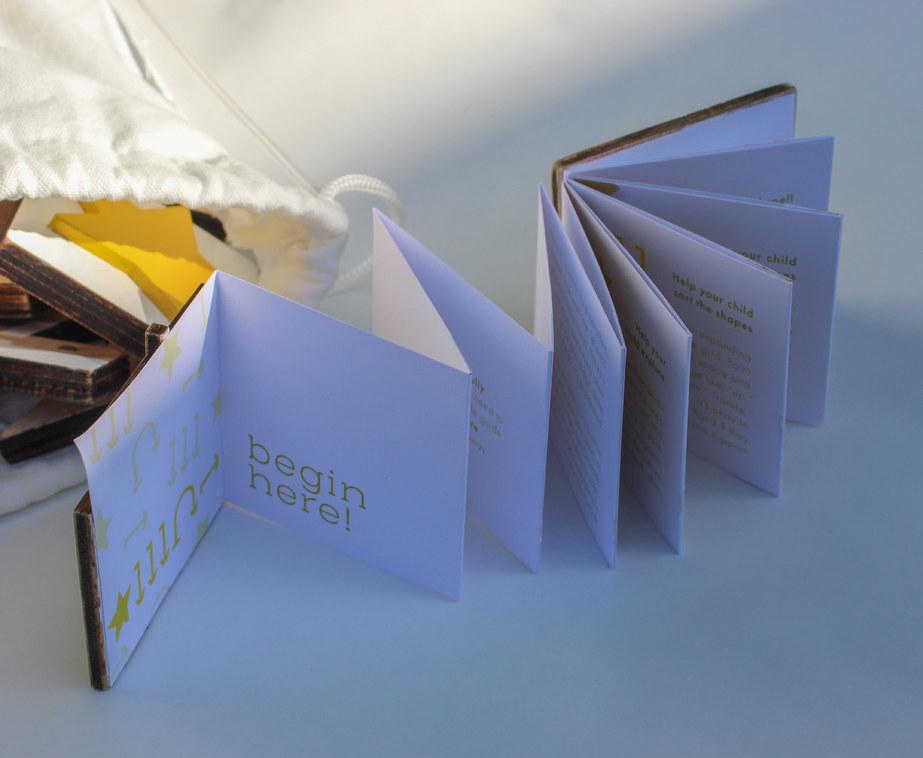
I created a prototype with a specific direction in mind.
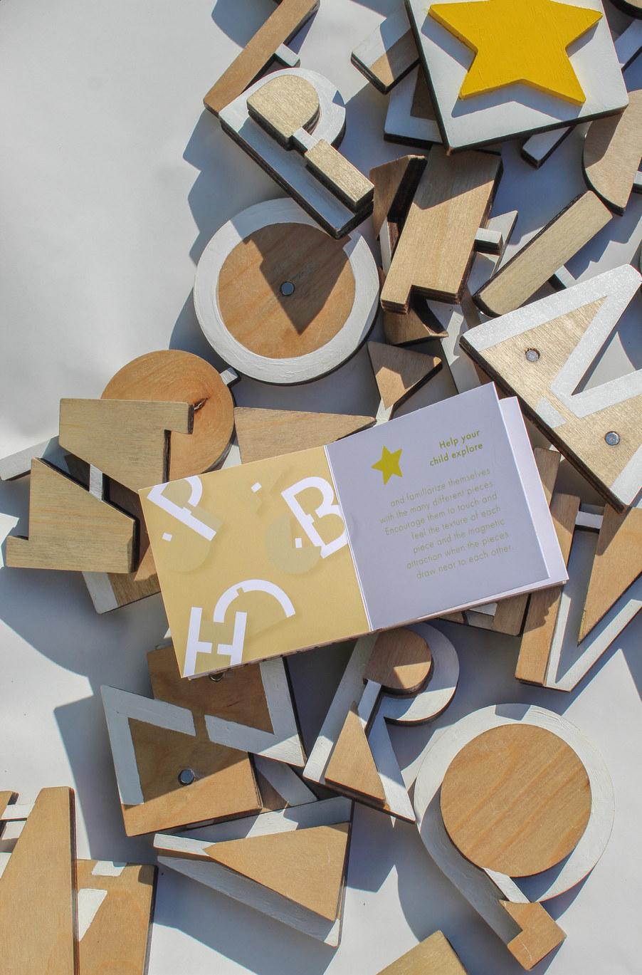
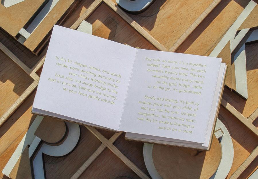
Aligning the form of this guide with the learning tool itself, I created an accordion booklet with a wooden front and back panel, recycling some of the unused laser cut pieces from previous steps.
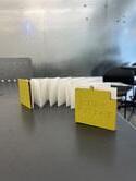
Within the booklet are simplified icons and descriptions outlining the various steps, accompanied by words of encouragement for parents and caregivers as they assist their child in using this tool.
Icons:
45
Document
46
What outcome has been achieved through these efforts?
47
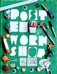
Now for a look at the final deliverables.
54
Reflect
What
will I take away from this process and where is credit due?
55
What did I learn?
Taking on this project has been a deeply personal journey, one that has unfolded against the backdrop of my own experiences and convictions. As I explored the complex realm of teaching children with learning disabilities, I found myself drawn to the profound challenges faced by parents and caregivers.
My research journey was enlightening, revealing a stark disconnect between foundational spatial awareness skills and traditional approaches to letter learning. This realization struck a chord within me, igniting a passion to explore a more holistic approach that could bridge this gap and empower both children and parents.
The creation of the letter building tool became a labor of love, infused with my own hopes and aspirations for education translated through design. Each wooden letter cutout, meticulously crafted, became a symbol of possibility—a conduit through which children could explore the world of letters at their own pace, within the nurturing confines of their home environment.
56
But beyond the tangible artifact lies a deeper narrative—a narrative of empathy, understanding, and personal growth. Through this project, I have come to appreciate the transformative power of design, and the profound impact it can have on user experience.
As I reflect on the journey from conception to realization, I am reminded of the countless moments of doubt and triumph, of setbacks and breakthroughs. But above all, I am reminded of the unwavering belief that every child, regardless of neurodiversity or neurotypicality, deserves access to education that is tailored to their unique needs.
This project has not only enriched my understanding of translation in education but has also reaffirmed my commitment to advocating for equity and accessibility in learning environments. Moving forward, I am inspired to continue exploring innovative avenues to support children with diverse learning needs, fueled by the belief that design has the power to transform lives and shape society.
57
Additional Acknowledgements
Centers for Disease Control and Prevention. (2024). Hearing Loss in Children. https://www.cdc.gov/ncbddd/hearingloss/treatment.html
Chew, K. (2013, April 22). “Would you abort a disabled child?” The Guardian. https://www.theguardian.com/commentisfree/2013/apr/22/abortdown-syndrome-child-society-shares-blame
Cleveland Clinic. (2024). Neurodivergent. https://my.clevelandclinic.org/health/symptoms/23154-neurodivergent
Brightwheel. (2024). How to Teach Letter Recognition in Early Childhood. https://mybrightwheel.com/blog/letter-recognition
Learning Disabilities Association of America. (n.d.). https://ldaamerica.org
Lillywhite, M. (2023, May 28). “The Bill Gates Technique Will Help You To Read More Books.” Medium. https://medium.com/mind-cafe/the-bill-gates-technique-will-help-you-toread-more-books-b51bc971bdd3
National Center for Education Statistics. (2023). Students With Disabilities. Condition of Education. U.S. Department of Education, Institute of Education Sciences. https://nces.ed.gov/programs/coe/indicator/cgg.
Smaller Scholars Montessori Academy. (2018). At What Age Should a Child Know the Alphabet?
https://smallerscholarshouston.com/at-what-age-should-a-child-know-the-alphabet/
Lastly, a very special thanks to the wolfpack, my family, my peers, and my professors, Grace Jun and Moon Jung Jang for the constructive feedback and encouragement this semester.
58
About this Book:
Design and Direction
Gracie Kolb Printer Blurb.com
Paper
Standard (70# White Uncoated)
Typefaces
Futura PT by Paratype Henderson Slab by Sudtipos https://fonts.adobe.com
59