AND RESPONSIBLE ARCHITECTURE
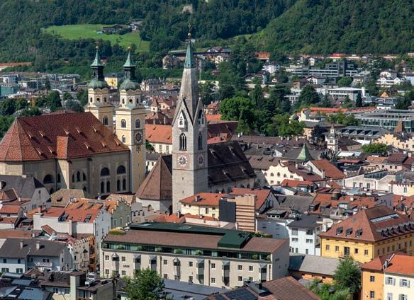
Boutique Hotel Badhaus, Brixen/Bressanone, Italien | Photo: Paul Kozlowski
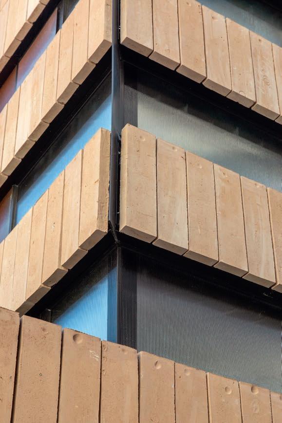
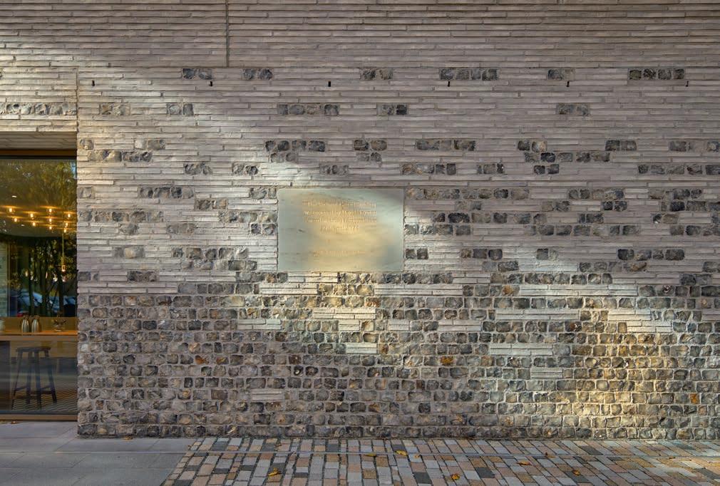
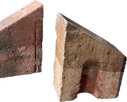
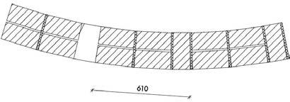
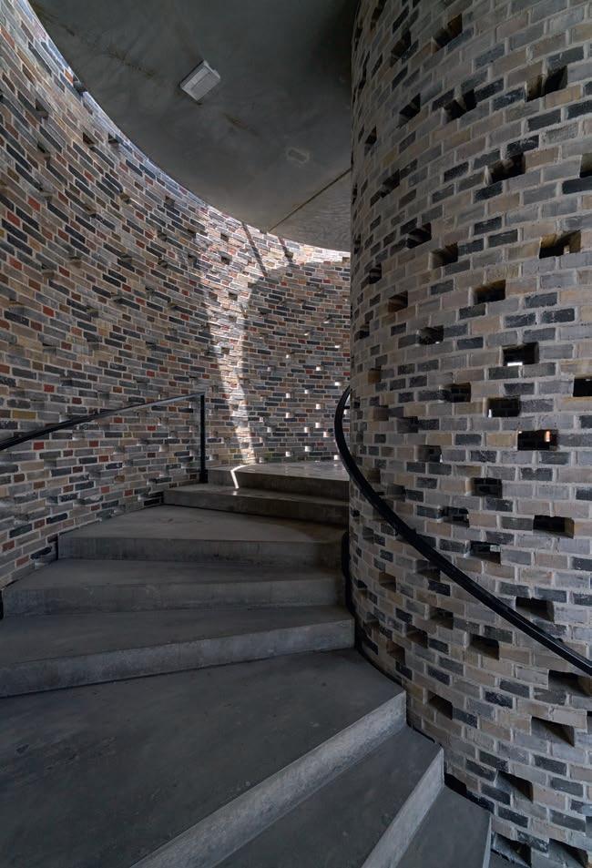
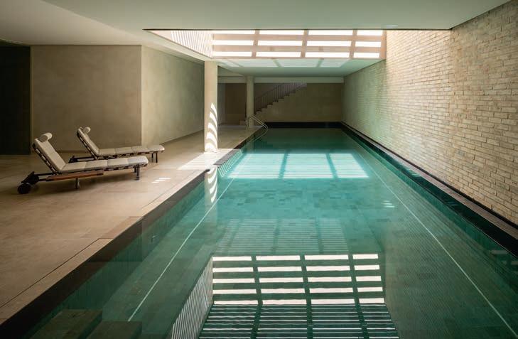
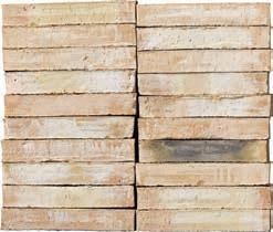
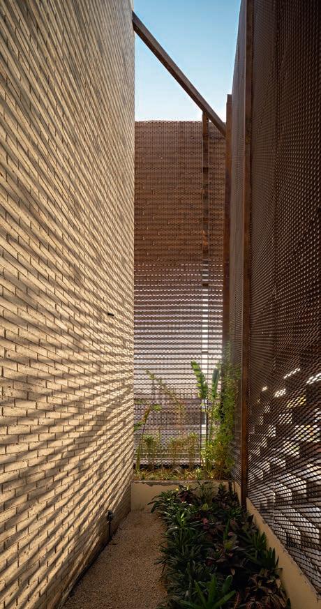
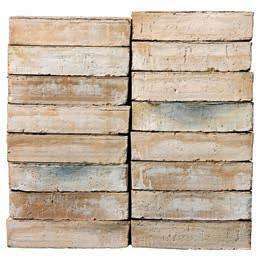
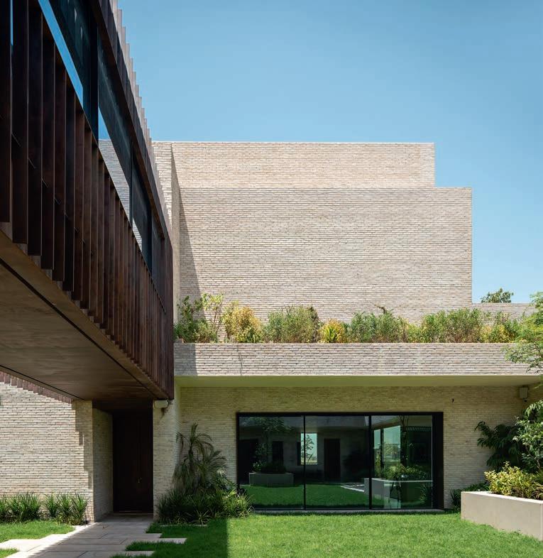
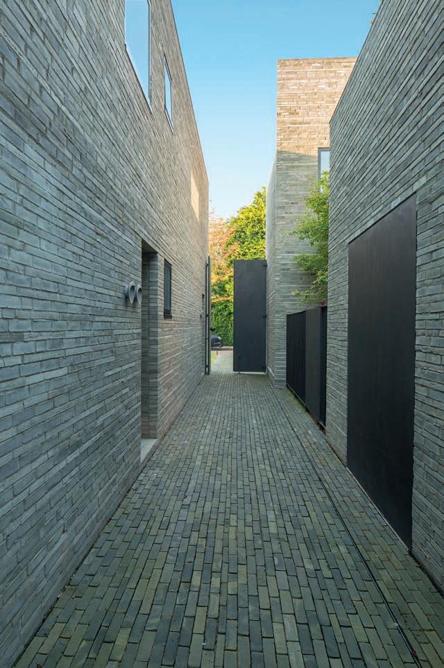
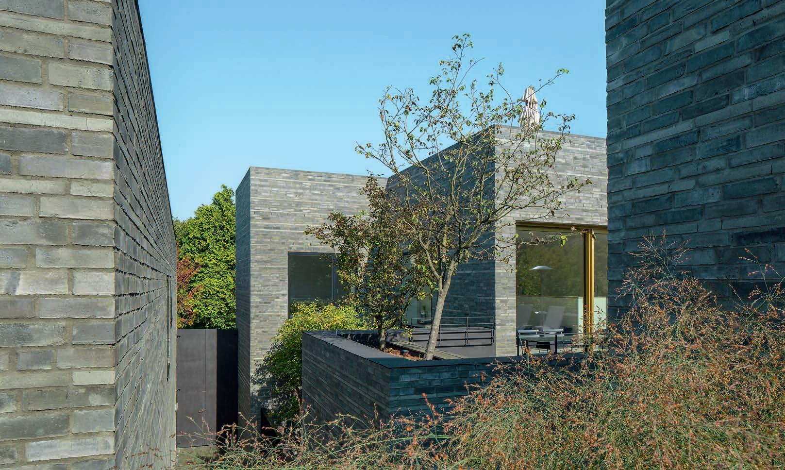
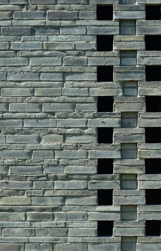
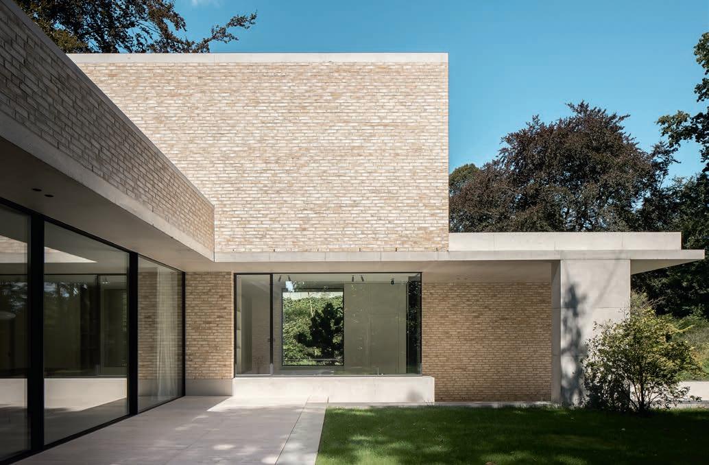
BRICKS ARE USUALLY STACKED IN HORIZONTAL COURSES, THEIR BROADEST SURFACES LARGELY HIDDEN FROM VIEW – NOT SO THE KOLUMBA BRICKS ON THE FAÇADE OF BADHAUS BRIXEN. HORIZONTAL BANDS OF VERTICALLY LAID BRICKS WRAP AROUND ITS ANGLED VOLUMES, GIVING IT A ROBUST AND CONSISTENT LOOK.
By Martin Søberg, PhD, architectural historian | Photos: Paul Kozlowski
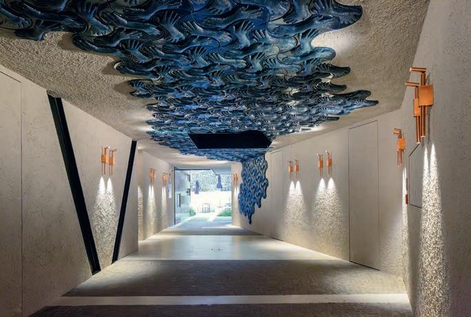
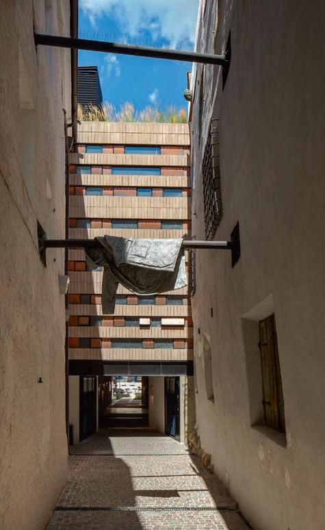
The Boutique Hotel Badhaus is a hidden treasure, obscured from view at street level. I find myself in the historic heart of Brixen in South Tyrol, a town surrounded by mountains and green vineyards. My journey has led me down winding streets and narrow alleyways, through historical gates and arcades, across market squares, and past water fountains, grand municipal buildings and the twin towers of the cathedral. A narrow opening between two old buildings leads to a gently descending and gradually widening passageway, which is eventually broken up by the layered Badhaus façade between the buildings on either side. The ground floor is open, though, and the passage leads under the hotel and out onto a bright, terraced courtyard.
Badhaus derives its name from the public bathhouse that stood here in the Middle Ages, which drew water from the nearby Eisack/Isarco River. It fell into disrepair over the centuries until it was unsalvageable. The name endures, however, as does the idea of a public bathhouse. The hotel strives to be accessible to all, its courtyard serving as a venue for concerts and spoken-word events. Inside, the influence of the historical baths is tangible in the design of the spacious en-suite bathrooms, which feature large niches clad in greyish-green quartzite.
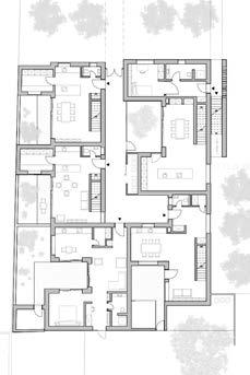
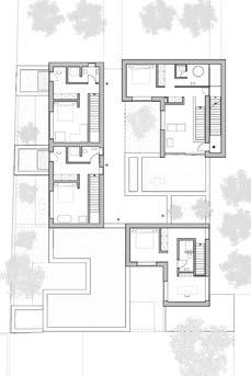
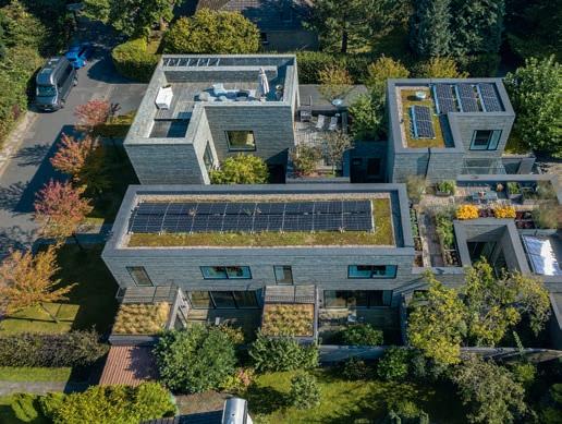
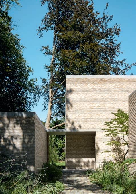
Badhaus consists of two irregularly shaped, concrete volumes of five and seven floors joined by a steel construction above the passageway, which provides access to the
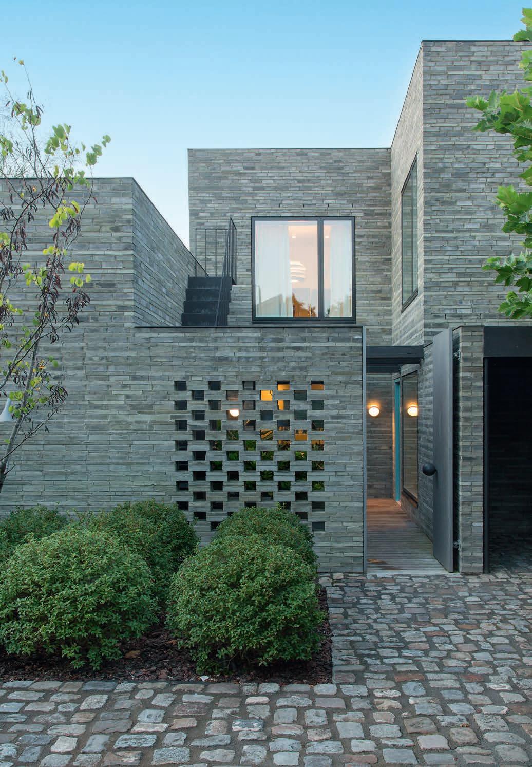
The lower floors in the hotel’s two main blocks are angled in relation to each other, creating a funnel-shaped exit to the courtyard. The bricks in the façade form horizontal bands that alternate with copper and opalescent glass. The copper will gradually patinate to black and then verdigris.
“Exposing the surface that would otherwise be hidden highlights the beauty of this architectural element: the handmade brick by Petersen Tegl.” Architect Michaela Wolf
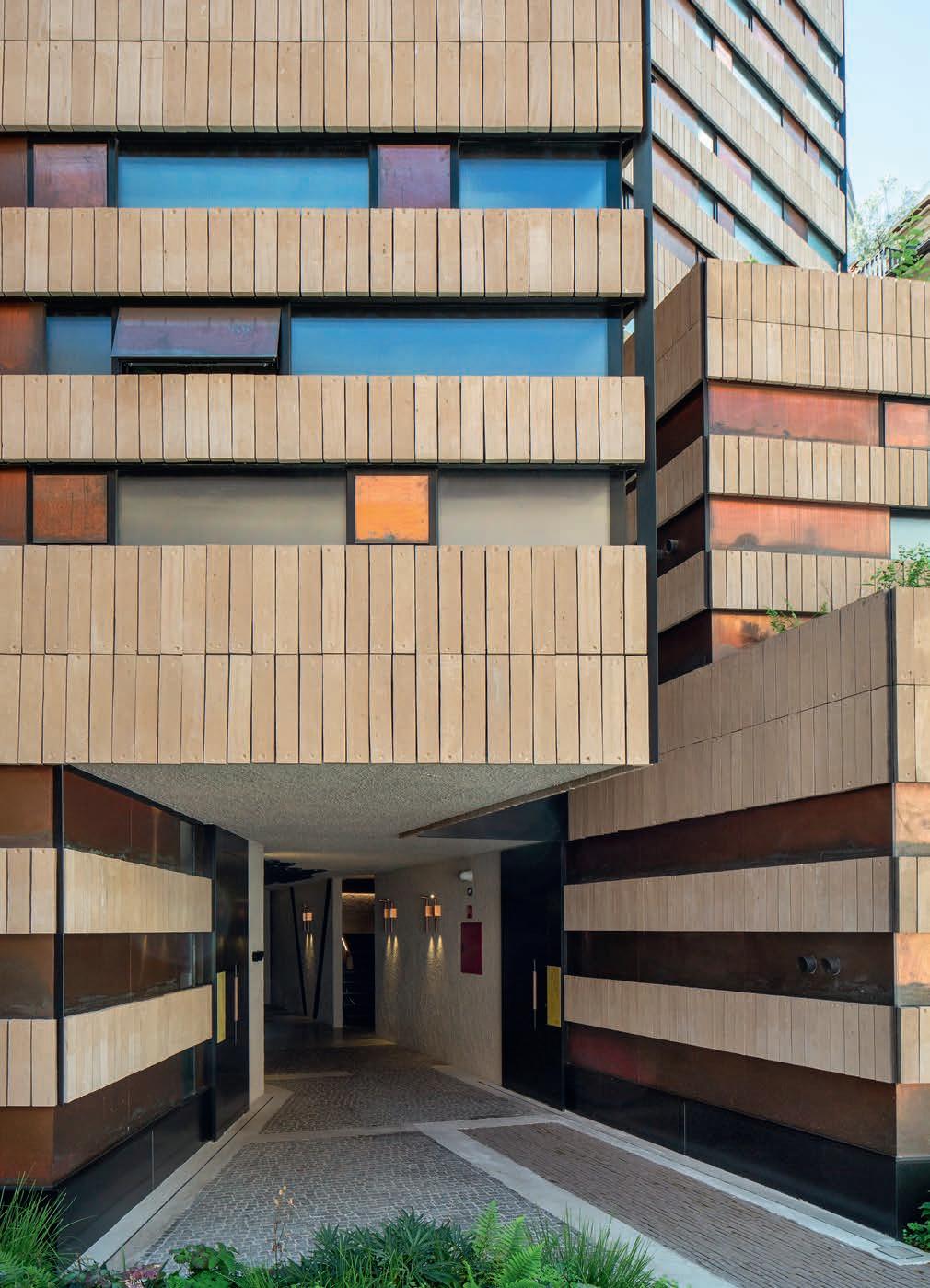
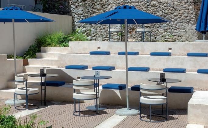
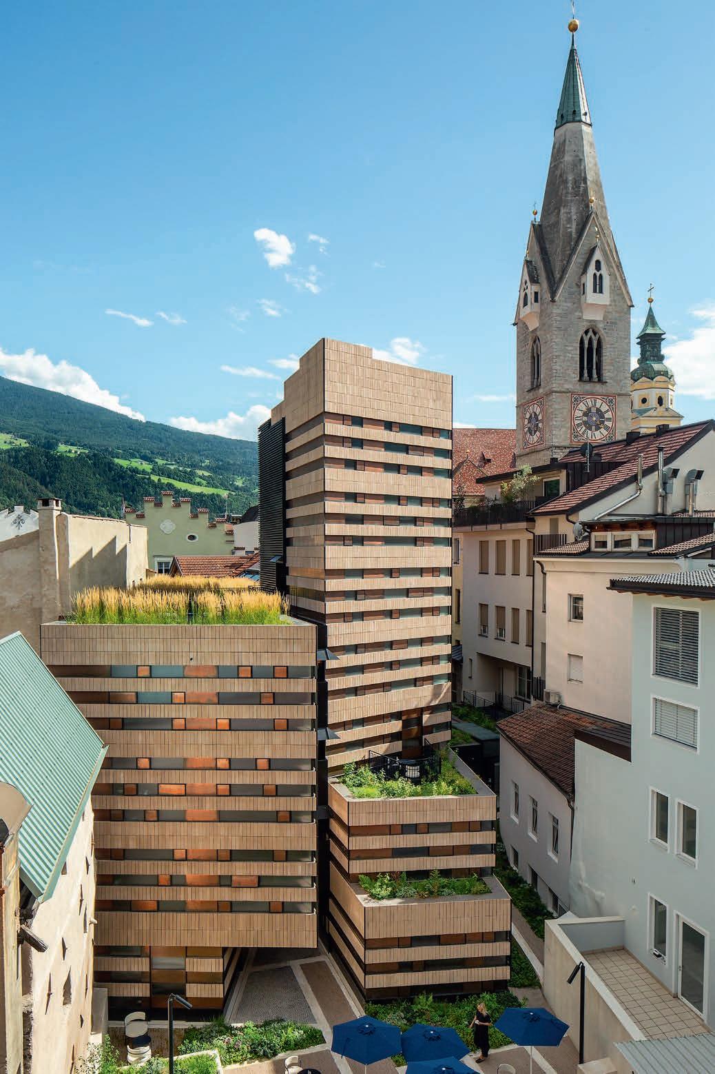
rooms. The shorter of the two volumes is topped by a communal roof garden. The staggered form of the taller, tower-like volume creates space for two terraced gardens. At the base of the tower is the reception area, which adjoins the hotel bar in another, pre-existing building. The almost patchwork composition of angled volumes, tied together by banded façades, shows respect to the neighbouring buildings.
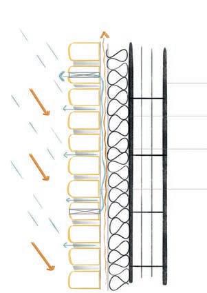
The façades are clad in Kolumba brick in a special colour and special format, mounted on a steel construction affixed to the concrete core. The bricks are laid vertically, with their broadest surfaces protruding outwards, creating an interplay between horizontal and vertical lines. The fingerprints left when the bricks were removed from their moulds by hand resemble rows of tiny ornaments. “The brick is actually a cladding, but it endows the building with a robust, hand-crafted character. Exposing the surface that would otherwise be hidden highlights the beauty of this architectural element: the handmade brick by Petersen Tegl. They are really wonderful, every single brick is unbelievably beautiful,” explains the architect Michaela Wolf, who founded bergmeisterwolf together with architect Gerd Bergmeister.
The brick bands alternate with others of opalised glass and copper in rhythmically staggered panels. To optimise the use of space, the external walls are as thin as possible, which also influenced the choice of brick.
“Kolumba was the only brick in the world that could give us both the length and thinness we wanted. It was perfect for us. The width was also crucial, as it determined the dimensions of the windows and copper panels. We may have chosen the brick, but it was the brick that chose the dimensions of all the other details. In other words, its three dimensions were instrumental to the design of the whole façade,” says architect Gerd Bergmeister.
Designed in collaboration with Petersen Tegl, the brick has a bright, warm colour that references the natural stone found

on the Baroque church of Saint Michael. A popular destination for pilgrims, the church is right next to the block in which Badhaus is nestled, its copper-clad spire visible from the upper floors of the hotel.
The passageway connecting the street to the hidden courtyard opens up a new thoroughfare and modest public space in Brixen’s dense urban fabric. The hotel rooms are compact and condensed, with something new around every corner: a special view or natural light, new material effects or access to otherwise concealed spaces. All of these features mean the building does not feel brand new. It looks as if it has emerged organically. The shape and flow of the rooms harmonise with their surroundings. The materials – brick, copper and glass –are familiar and replicated throughout the historic town, yet reimagined here in a thoroughly modern way.
Boutique Hotel Badhaus, Brixen/Bressanone, Italy
Client: Gut Wohnen
Architect: bergmeisterwolf
Contractor: Gut Wohnen
Engineer: Exact - Ingenieure
Built: 2024
Brick: F59, Special colour
When mounting Petersen Tegl’s handmade bricks on metal or timber structures, Cover is the typical choice. At Badhaus in Brixen, the client and architect chose Kolumba.
“Kolumba
was the only brick in the world that could give us both the length and thinness we wanted. It was perfect for us.”
Architect Gerd Bergmeister
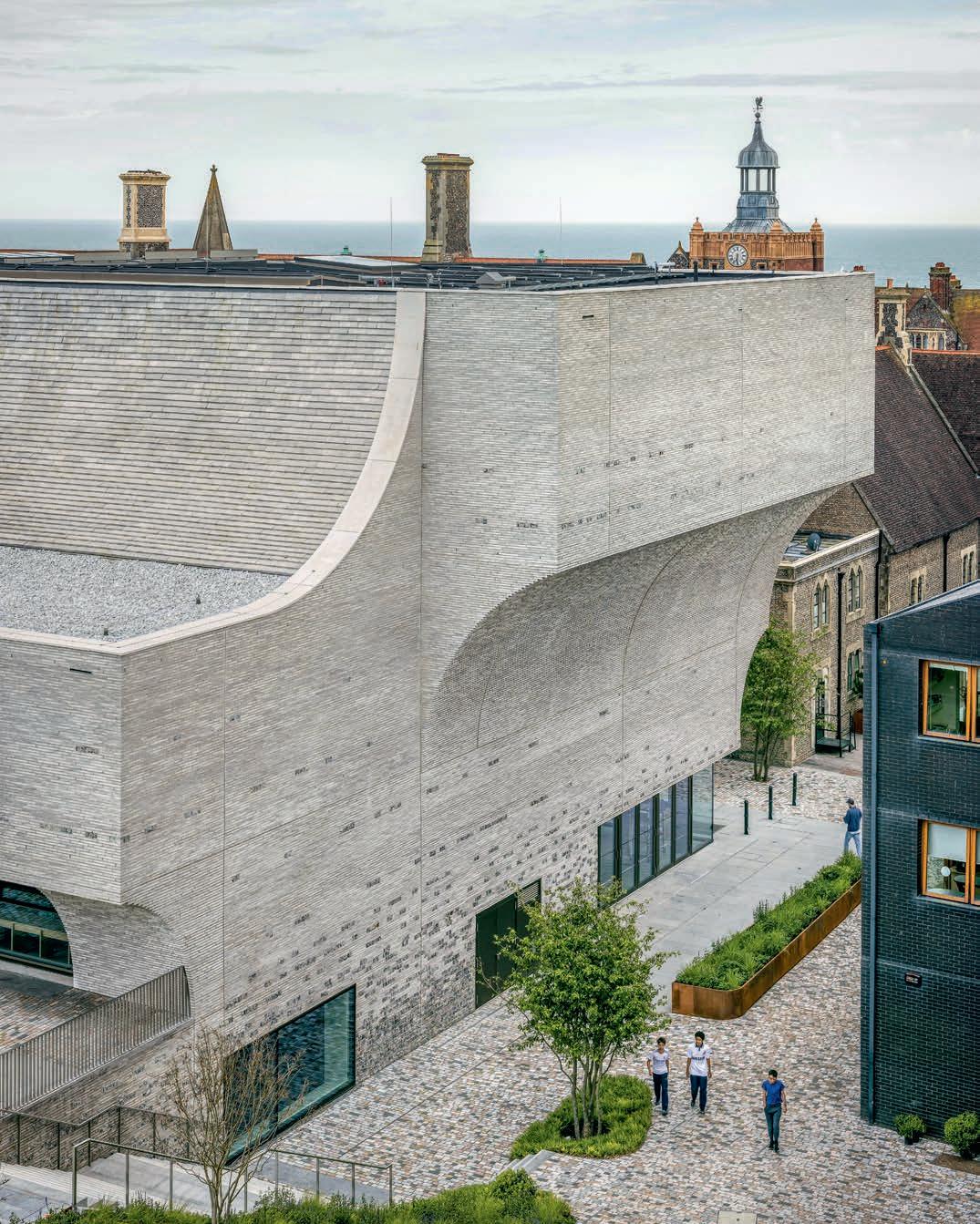
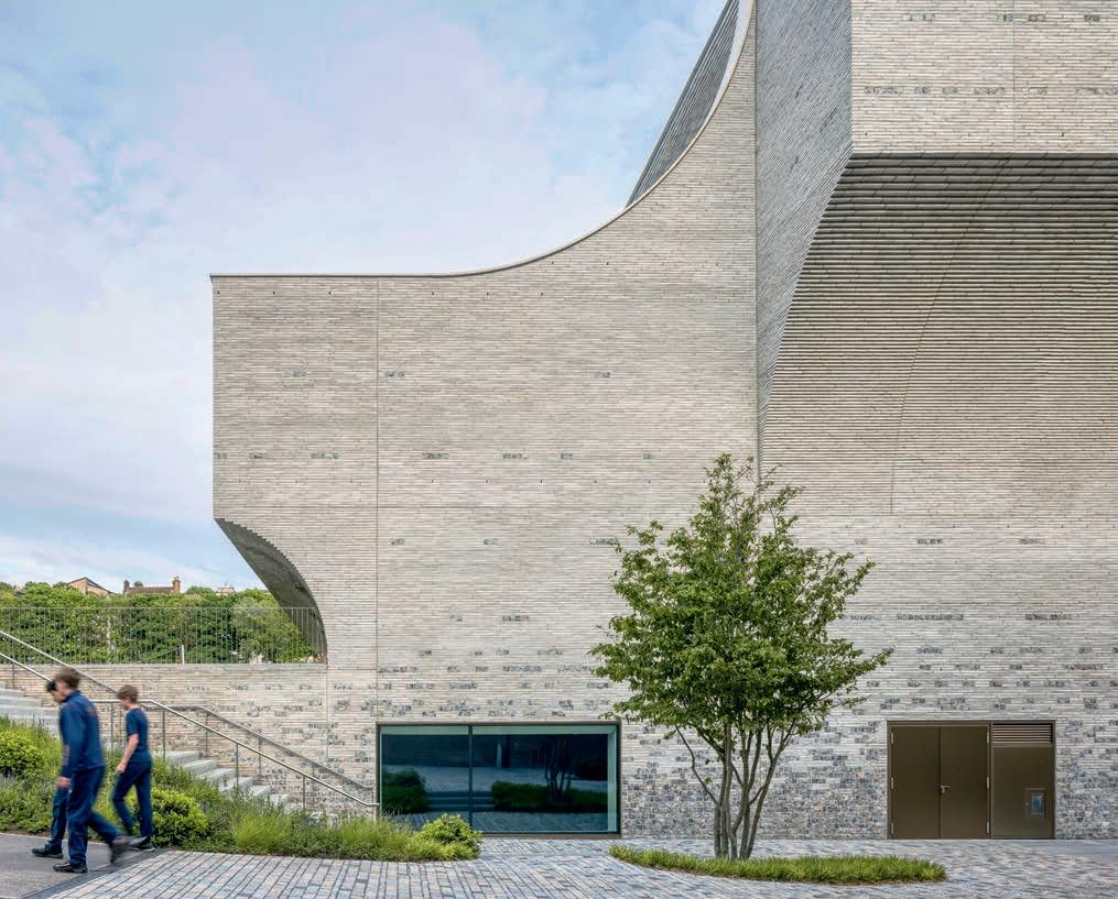
THE TAUT, ARCHING BRICKWORK OF THE RICHARD CAIRNS BUILDING SEEMS TO DEFY GRAVITY AS IT REACHES FOR THE SKY. THE SENSE OF MOVEMENT ECHOES THE SPIRIT OF THE BUILDING, A SPACE FOR TEACHING THE PERFORMING ARTS: DANCE, THEATRE AND MUSIC.
By Martin Søberg, PhD, architectural historian
Photos: Stijn Bolleart
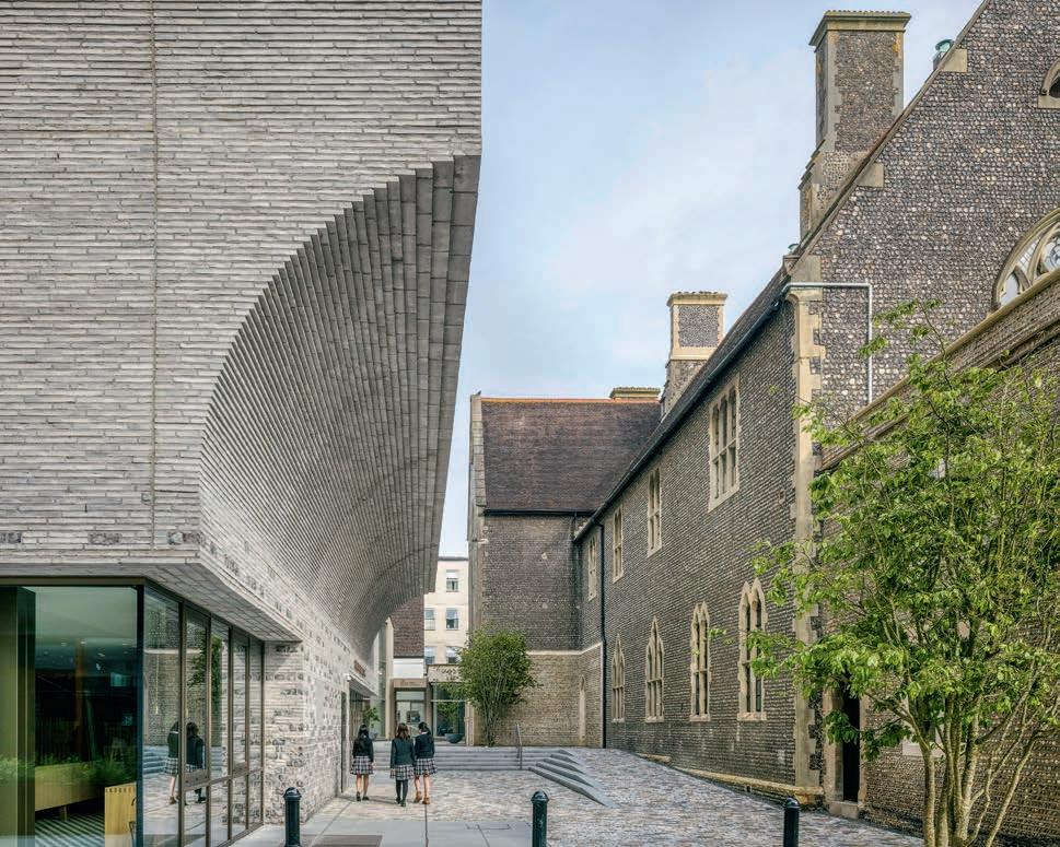
Brighton College, a private boarding school, was founded in the mid-19th century. Gilbert Scott, one of the most prominent English architects of the day, used flint and sandstone in his design of both the main building and the attached neo-Gothic chapel and hall. Flint is commonly found on the nearby coast, embedded in the limestone layers on the cliffs or strewn across the beaches due to erosion of the cliffs. Over the past 15 years, Brighton College has greatly expanded, adding new buildings designed by various architects from the UK and abroad, to house a range of subjects and activities.
The latest addition is the Richard Cairns Building, which stands in the middle of the campus, between Gilbert Scott’s main building and the large sports field known as Home Ground. It serves as a counterpart to the music building, and both are on the site’s central axis. Designed by KRFT and Nicholas Hare Architects, the building connects two different ground levels, and spans four floors, including a basement.
“We wanted a brick that doesn’t feel new, but as if it has been there since time immemorial. A brick on which the patination process looks natural.”
Thomas Dieben, architect
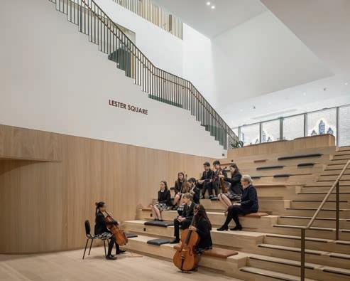
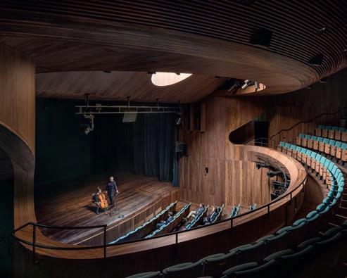
The floors are linked by the staircase in the central atrium, where students meet and mingle. The ground floor houses a café and a lounge. The basement contains rehearsal rooms and two double-height studios for dance and theatre, with high windows that establish visual links both to the surroundings and to other spaces in the building, without seeming intrusive. The English and computer-science classrooms are clustered at an offset angle to the north-east on the first and second floors, while the upper south-west section houses a 400-seat theatre. The auditorium has a large round skylight, a recessed balcony and is clad in dark walnut, which completes the intimate atmosphere.
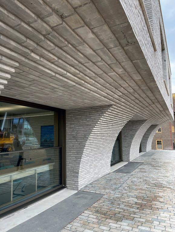
The theatre makes its mark on the exterior in the form of concave cantilevers to the west and south, which frame the main entrance. To the north, a half-arch rises straight out of the ground and forms an open veranda towards the sports field. Above the classrooms to the north-east, the cantilevers are countered by curved surfaces that swoop up towards the flat roof. The many curves, which vary in both proportion and direction, add a sense of movement, even dance, to the otherwise compact body. They also echo the neo-Gothic pointed arches and rose windows of the main building.
Both the outer walls and roof curves are clad in brick. The walls are in Kolumba in varying lengths, while the roof curves are clad in Cover.
“The façades and roof had to be made of a single material, so Petersen Tegl was ideal as Cover is made from exactly the same clay as Kolumba. While the curved parts were prefabricated, the bricklaying for all the vertical surfaces was done on site,” explains Thomas Dieben, architect and founding partner of KRFT
In homage to Gilbert Scott’s main building, flint has also been incorporated into the masonry. It dominates the bottom of the ground floor, and is then used increasingly sparingly further up the façade, with brick eventually taking over completely.
“We wanted a light-coloured material that matched the neo-Gothic combination of flint and sandstone. We didn’t want to use sandstone itself, but something more contemporary, which could be used in a different way. We also wanted
“The façades and roof had to be made of a single material, so Petersen Tegl was ideal, as Cover is made from exactly the same clay as Kolumba.” Thomas Dieben, architect
Client: Brighton College
Architect: KRFT in collaboration with Nicholas Hare Architects
Main contractor: Gilbert Ash
Civil engineer: Momentum
Landscape architect: Bradley-Hole Schoenaich
Completed: 2024
Brick: F563, C563, both in custom colours and based on K91 and C91
“Flint has a range of colours, from white to dark brown and black. We’ve brought all of these into the brick, which was made specially for the building.”
Thomas Dieben, architect
a material capable of withstanding the coastal climate’s salt, strong winds and heavy rain. Hence the marriage of flint and brick,” says Dieben about the choice of brick.
While the darker, glossier flint contrasts with the lighter, more matte brick, the materials are also linked.
“Flint has a range of colours, from white to dark brown and black. We’ve brought all of these into the brick, which was made specially for the building. Based on K91 and C91, we refined a Kolumba and a Cover to incorporate a range of light and dark hues, and even some splashes of white. We wanted a brick that doesn’t feel new, but as if it has been there since time immemorial. A brick on which the patination process looks natural,” Dieben concludes.
The result endows the building with an almost geological feel, like a block cut directly out of the light-coloured English cliffs – but with a completely contemporary aesthetic.
DESIGNING A MUSEUM ON A HISTORICALLY SYMBOLIC SITE, THE BUILDING AND LANDSCAPE ARCHITECTS EMPLOYED A SINGLE TYPE OF BRICK TO CREATE A CONTINUOUS EXPERIENCE OF THE SETTING AND ADVANCE THE MUSEUM’S MISSION.
By Michael Sheridan, D.Arch. and author | Photos: Dean Kaufman
Located on the waterfront of Charleston, South Carolina, on the east coast of the United States, the International African American Museum represents a union of building and landscape that is indivisible from its historic site. That site is Gadsden’s Wharf – the last legal point of entry for enslaved Africans before the import of human beings was finally outlawed by the U.S. government in 1808. During 1690-1807, Charleston was the epicenter of the African slave trade in British North America and later the United States, as more than 150,000 captives arrived and were sold into bondage. Historians estimate that 80% of African Americans now living can trace at least one ancestor to the Port of Charleston.
Commissioned to design a museum that would examine both the tragedy and legacy of the African slave trade, the architectural team of Pei Cobb Freed & Partners and Moody Nolan adopted a strategy of formal restraint. In the words of Henry N. Cobb:
“As the place at which many thousands of Africans from diverse cultures first set foot in North America, Gadsden’s Wharf is not just the right location to tell this story; it is hallowed ground. Hence the special design challenge of the International African American Museum: to build on this site without occupying it.”
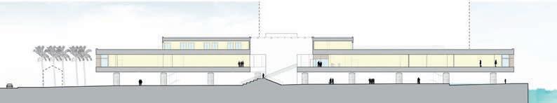
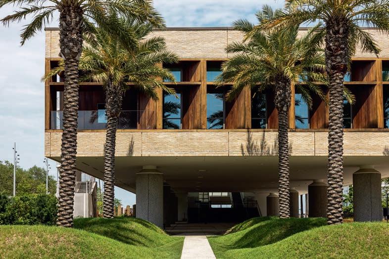
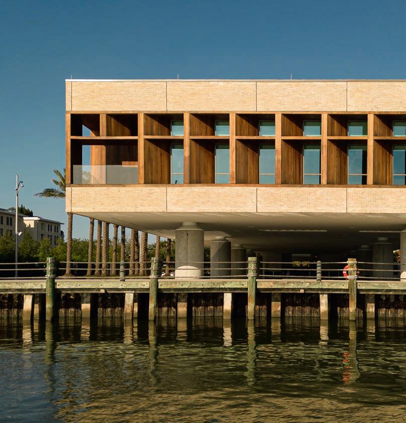
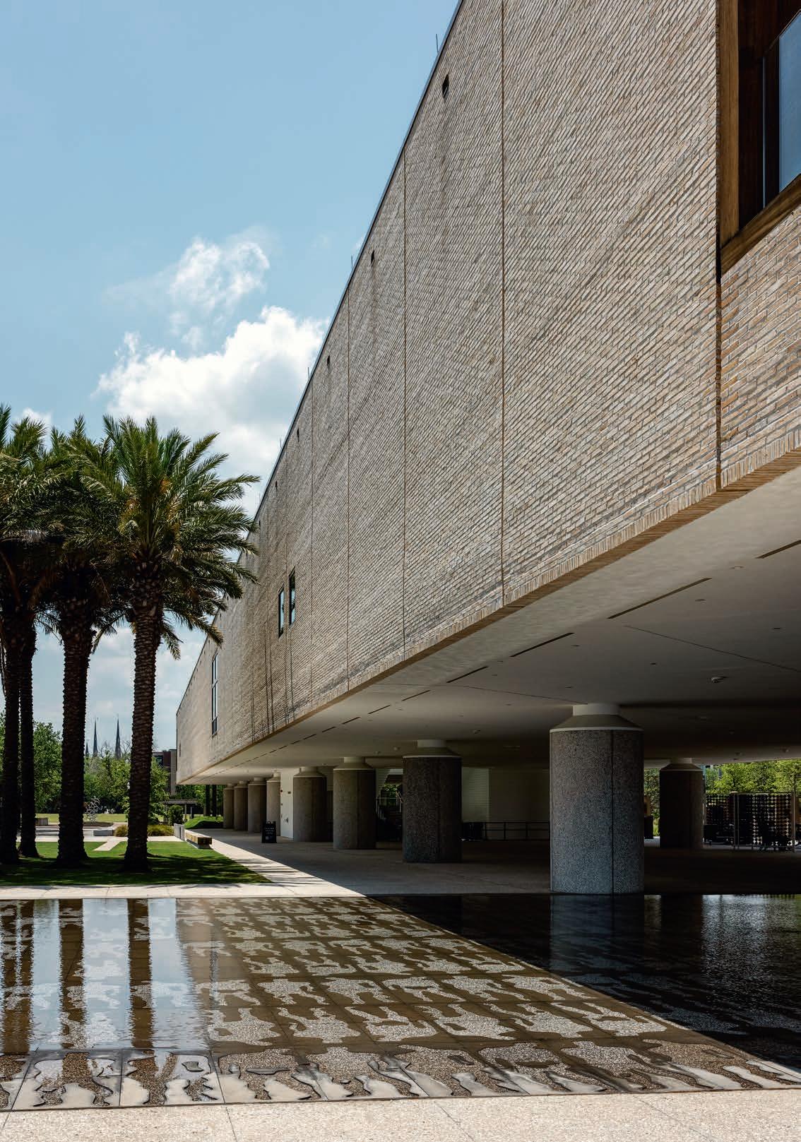
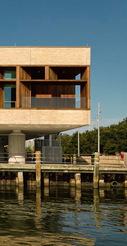
To meet that challenge, the architects designed a rectangular one-story building with a monumental scale – 26 x 130 m – that is elevated about four meters above the surface of the wharf and supported on two rows of concrete piers. By doing so, they preserved the physical experience of the setting that is the museum’s essential artifact.
Extending that sense of restraint, the architects limited the openings in the building and clad the walls in panels of waterstruck yellow-grey D71 FF bricks that imbue those surfaces with nuances of colour and texture that change according to the character of the daylight. The primary architectural features are concentrated at the entrance and at the two ends of the building, where a wall of windows orients visitors in the setting and a massive timber framework tempers the intense light of the Carolina sun.
From the wharf, visitors ascend a monumental stair that rises through a covered atrium and delivers them to the exhibitions, which are arranged on a central axis that extends the length of the rectangular building. At either end of that axis, the unity of architecture and exhibition program is revealed by the contrasting views of the surroundings. To the east, a gallery devoted to the African cultures overlooks the Cooper River where it flows into Charleston Harbor. At the western end, a gallery overlooking Charleston allows visitors to research their family histories. As such, a tour through the exhibitions is a symbolic journey that connects the Atlantic Ocean with the Lowcountry region beyond the city, where vast numbers of enslaved arrivals would toil in the rice fields.
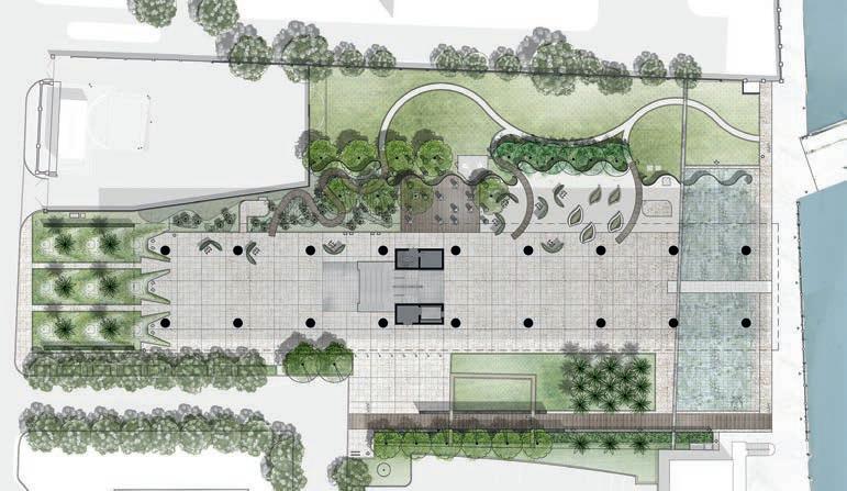
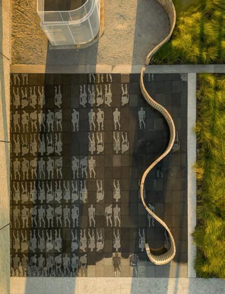
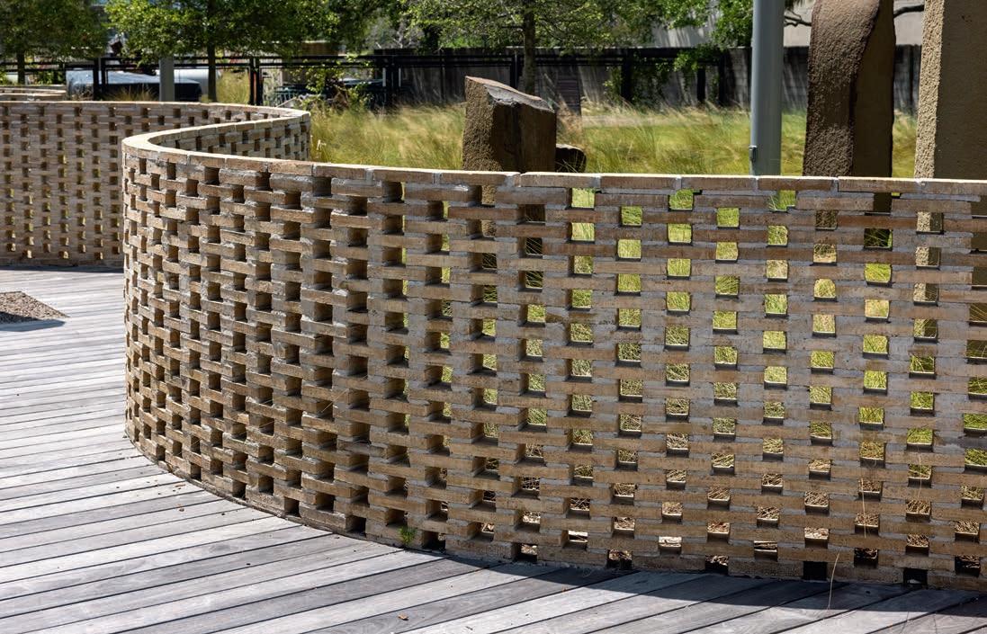
The simplicity of the exhibition building is countered by the complexity of the African Ancestors Memorial Garden, which was designed by Hood Design Studio and covers the entire site. The composition of planting and installations echoes the symbolic journey through the building, so that a visitor’s impressions within and without are united in an immersive experience. The largest installation is the trio of serpentine walls made of the same brick used to clad the exhibition building, which are arranged in parallel on the north side of the garden. The openings in the walls preserve the freedom of vision established by the elevated building, such that the walls also mark the site without occupying or concealing it, while providing powerful contrasts in both form and pattern.
Within and without, the International African American Museum derives its narrative power from an admirable economy of form. Working with a set of standard modernist elements –slab, columns, brise soleil – Pei Cobb Freed & Partners and Moody Nolan performed an act of architectural alchemy and created a building that is specific to site and light, by virtue of its restraint. Around and below that non-monumental monument, Walter Hood and his colleagues created an analogue to landscape that is experienced as an extension of the architecture due to the consistent use of material. The resulting unity of building and landscape is a reminder that the choice of material is at least as important as the choice of form, and that the versatility of brickwork provides architects with a means of creating a complete experience, and so a genuine place.
International African American Museum, Charleston, South Carolina, USA
Client: City of Charleston, International African American Museum
Design architect: Pei Cobb Freed & Partners
Executive architect: Moody Nolan
Landscape architect: Hood Design Studio
Contractor: Turner - Brownstone
Structural engineer: Guy Nordenson and Associates
MEP-FP engineer: Arup
Inaugurated: June 24, 2023
Brick: D71 Flensburg format
The African Ancestors Memorial Garden spans the whole of the museum grounds. It was inspired by the tradition of ’hush harbours’ – spaces where the enslaved Africans gathered in secret to share stories and keep their African traditions alive.
In a shallow pond near the quayside, ghostly outlines of prostrate figures serve as a reminder of the transatlantic crossing that claimed the lives of so many people. Photo: Fernando Guerra
Three undulating perforated brick walls, built in D71 FF meander in parallel rows through the north side of the garden. They shield a lawn and form a framework for the works of art that extend all the way to the water’s edge.

Interview with Matteo Milani, associate partner, Pei Cobb Freed & Partners Architects LLP
Did you decide right at the start to use brick for the museum’s façades, or did you consider other materials? During the concept phase, we explored several cladding options for the museum’s façades. Initially, we settled on a natural stone rainscreen system featuring an African granite, which we presented to both the IAAM Board and the Charleston Board of Architectural Review. However, as we progressed into schematic design and refined the cost estimates, we collectively decided to switch to a brick rainscreen system. Brick not only aligned more closely with our aesthetic goals but also proved to be more cost-efficient.
From the outset, hand-set brick façades appealed to us because they complemented the museum’s minimalistic architectural language. Now that the building is complete, it’s clear that the craftsmanship inherent in brick construction brings a tangible warmth to the design. The bricks – along with the sapele wood louvers on the east and west façades – create a welcoming presence while grounding the building in the complex history of its site.
Did you consider other colours before opting for the light yellow one you chose?
No, from the beginning, we were drawn to a colour that would depart from Charleston’s traditional red-orange or brown brick palette. We wanted to use a traditional material in an unconventional way, underlining the museum’s unique mission. It was important that this building not be mistaken for a historical or traditional structure – whether residential, commercial or institutional. Petersen’s pale yellow D71 brick offered the perfect combination: it distinguished the building from its surroundings while harmonizing beautifully with the other materials in the project.
Why did you choose bricks from Petersen?
Petersen was top of mind from day one due to their strong reputation in the architecture community. The handmade production process means each brick is slightly different – an asset, not a flaw, in our view. The water-struck surface and firing technique create a texture and finish that are especially compelling when used across large, continuous surfaces like ours.
The unique proportions of the FF format brick (228 x 108 x 40 mm) supported our design concept, emphasizing the building’s elongated, horizontal form. Much like our choice of colour, we wanted to avoid the familiar aesthetic of traditional brick buildings in the region, and these unusual dimensions helped reinforce that distinction.
We were already familiar with the quality of Petersen’s bricks through samples and published work in our library. Once we reached out to Petersen’s export manager, Stig H. Sørensen, we quickly received both individual brick samples and panelised mock-ups to confirm our direction.
Did you consider brick from other companies?
We did include a regional manufacturer for comparison, but given the project’s design goals, there was consensus from all stakeholders that Petersen bricks were the right choice. No further discussion was needed.
“The
handmade production process means each brick is slightly different – an asset, not a flaw, in our view.”
Matteo
Milani, architect
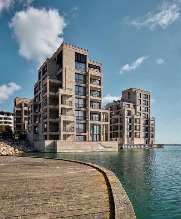
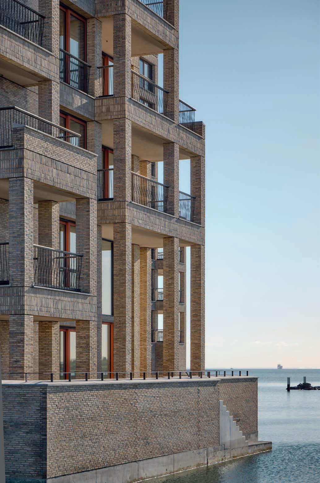
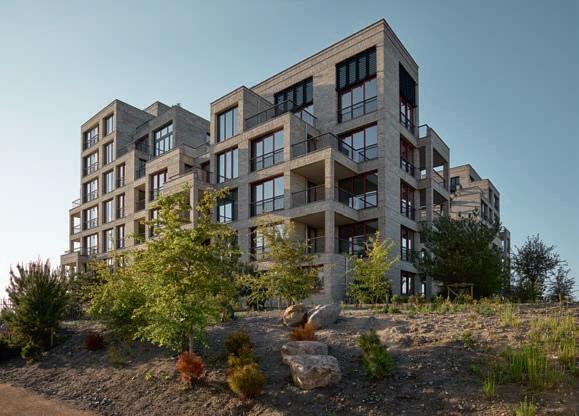
THE GOLDEN HUES OF A BRICK-BUILT RESIDENTIAL COMPLEX JUST NORTH OF COPENHAGEN EVOKE THE SANDY SOIL FROM WHICH IT RISES. THE USE OF THE FLENSBURG FORMAT ENDOWS THE BRICK-WORK WITH A FINE, LAYERED STRUCTURE, WITH NARROW BONDS CLEARLY DEFINING THE VOLUMES IN DISTINCT, ‘SEDIMENTARY’ LAYERS.
By Professor Thomas Bo Jensen, MA in Architecture, PhD, professor and vice dean at the Aarhus School of Architecture
Photos: Anders Sune Berg
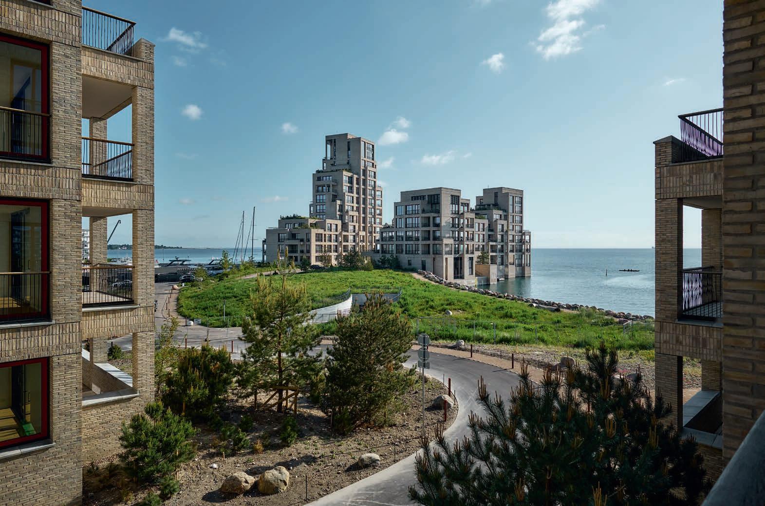
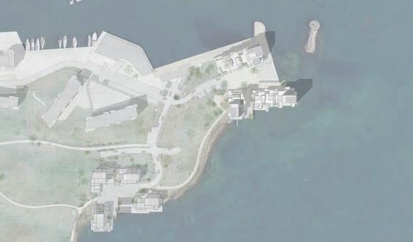
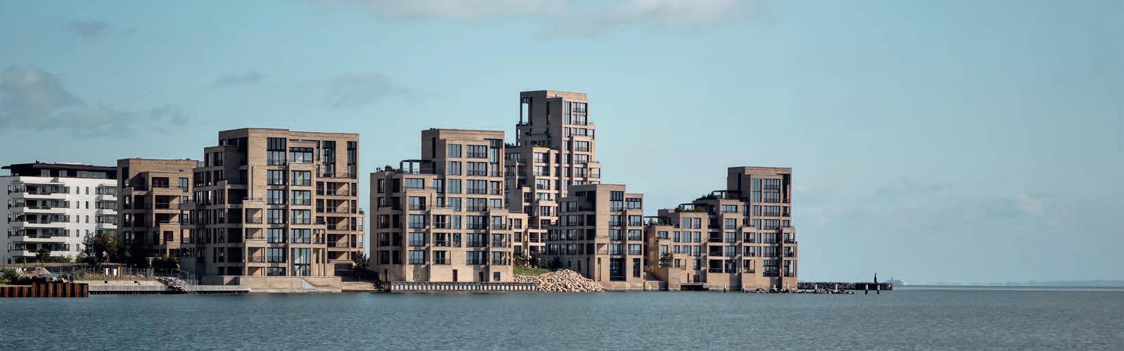
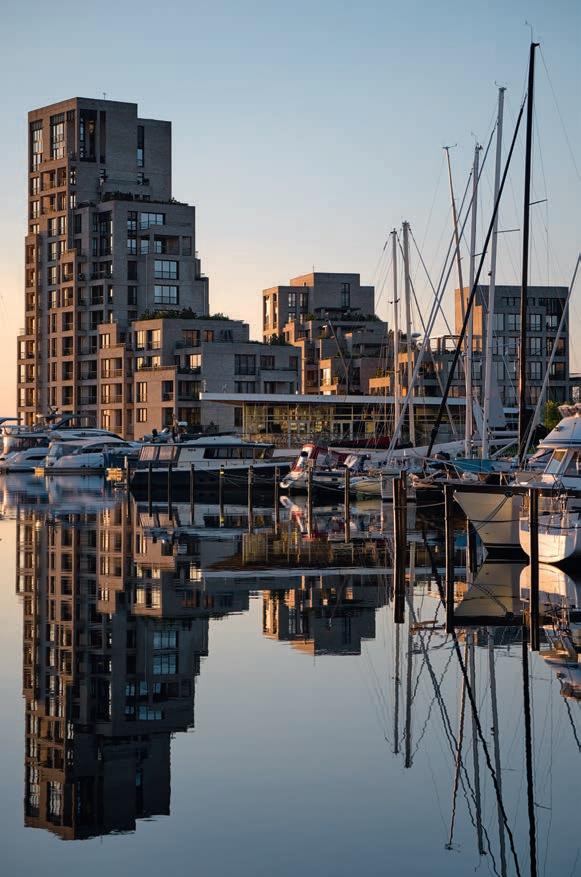
Contemporary multi-storey brick buildings can often seem generic. They lack a singular identity beyond the limited variations afforded by facing walls and different combinations of bricks and their colours. Bricks alone are not always able to save us from the monotonous repetition of standard proportions. Occasionally, everything goes completely awry, and the bricks just look as if they have been haphazardly attached to a surface, oblivious to the law of gravity, more ‘graphic’ than tectonic. The Tuborg Strandeng development in Hellerup adopted a different approach. Given that price per square metre targets a wealthy clientele, you might expect an exclusive and refined approach to materials and detailing. However, the architects have pushed the design towards a more angular and rudimentary look, akin to cliffs or old ruins. The overall effect recalls an ancient sunken city – an Atlantis –emerging from the sea.
Apart from a discrete concrete band at the waterline, the dominant feature consists of yellowish bricks that subtly echo the sandy soil below. The architects drew inspiration from the Flensburg format, a dominant shape in Baroque-era Copenhagen. Roughly 38 mm high and about 15 mm slimmer than the modern Danish 54 mm standard format, it gives the brickwork a fine, layered structure, in which the narrow headers define the volumes via distinct, ‘sedimentary’ layers. This choice was key to the Tuborg Strandeng development, as it necessitates a close weaving together of the structural combination of columns and beams. Whereas the façade walls
Distinct protrusions and recesses create a visible relief effect. D72 FF is used on all of the façades. Its colours alternate between yellow and light green and it has a dusty grey surface. Both Danish standard format and Flensburg are used in the brick-on-edge courses and headers in the horizontal bands. The openings are classically framed and the separate floors clearly delineated.
The brickwork is more of a form-giving structure than a surface. The balconies stand out as volumes in their own
not just as mounted elements.

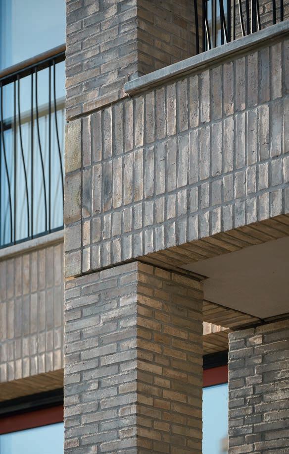
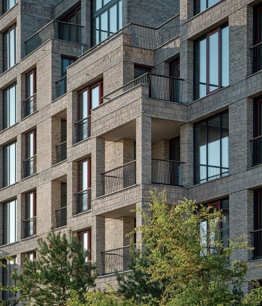
and columns are clad in straight horizontal layers, the beams are clad with perpendicularly aligned bricks in a stacked bond. Lower down, there are upright courses; while further up, courses of headers dominate. This beam cladding continues horizontally throughout the enclosed brick sections, so that the lateral orientation of each storey is marked across the exterior. Towards the top, the buildings are capped with a narrowly protruding band of courses of headers, which accentuate the edge of the cornice and make it stand out sharply against the sky. This distinctive feature is notable as a rare occurrence in modern construction. The clearly defined base and cornice help both anchor the volumes and delineate the skyline. Overall, the buildings radiate a calmness that contributes to their long-term credibility. However, the brickwork here emerges directly from the sandy soil, an important attribute in this particular location. This is not a townhouse that has to relate to a street and its furniture. Rather, they are coastal structures, more akin to a farmhouse in the West Jutland dunes. What was required was a feeling of direct physical contact with the terrain.
In addition to the bricks, several other thoughtfully selected measures imbue the buildings with character, for example, the window frames, colour scheme and railings. As all of the windows are full height, and each apartment has at least two balconies, parapets and railings were required. Here, the architects again drew inspiration from architectural history, this time from the elegant solutions of functionalism. The railings are supported by two paired rows of thin steel bars. The inner bar is bent slightly backwards and downwards, creating a delicate filigree pattern that changes with the angle of view. From the front, they look uniformly vertical, but from the sides,
they intertwine in a fine, rhythmic interplay that catches and reflects the light in a polyphonic manner. The effect is that of a shimmering ornamental ribbon, the delicacy of which contrasts beautifully with the brickwork.
The complex sits gently on the salt meadow that will eventually grow around it. Landscape architect Julie Kierkegaard has made a virtue of retaining the sandy soil, rather than enriching it with topsoil, to encourage vegetation that is naturally found in this habitat. In addition to various grasses and meadow flowers, pine trees have been planted across the site, including on the balconies, which extends the landscaping vertically.
Finally, a brief note on the choice of mortar and contemporary building in general. Softer, hydraulic mortars are actually on the market, but their use remains uncommon. The harder cement mortars have a lifeless surface, and you end up with more than enough expansion joints. Even a subtly concealed sawtooth joint (of which there are plenty here) can’t hide this problem. Nonetheless, the Tuborg Strandeng development upholds an exceptionally high standard, both in the way it adapts to its landscape and by embracing the architecture of the past.
Tuborg Strandeng, 88 apartments, Hellerup, Denmark
Client: Danica Ejendomme
Architect: Lundgaard & Tranberg Arkitekter
Landscape: Lundgaard & Tranberg Arkitekter, Julie Kierkegaard
Contractor: NCC
Engineer: Artelia
Built: Coastal House 1+2: 2016–2022. Coastal House 3: 2016–2025
Brick: D72 FF, D72 DNF

FOR THE MULTI-STOREY CAR PARK ON HAVNEØEN IN VEJLE, RAVN ARKITEKTUR DESIGNED A FUNCTIONAL SOLUTION IN WHICH BRICK IS NOT MERELY THE CHOSEN MATERIAL, BUT THE PROJECT’S CENTRAL NARRATIVE.
By Ida Præstegaard,
MA in Architecture | Photos: Anders Sune Berg
Only 200 metres from Fjordenhus, Kirk Kapital’s headquarters at the far end of Vejle Harbour is a multi-storey car park that is clearly related to its iconic neighbour, designed by architect Sebastian Behmann and Studio Olafur Eliasson.
Before Fjordenhus was inaugurated in 2018, the need for extra parking had already been identified. Kirk Kapital asked RAVN Arkitektur to think about solutions to be built once the HQ was completed and the surrounding area taken into use. Several alternative uses, including campervan parking, were considered. Ultimately, the choice fell on a two-storey underground car park – a solution that was necessary to balance cost and the water level.
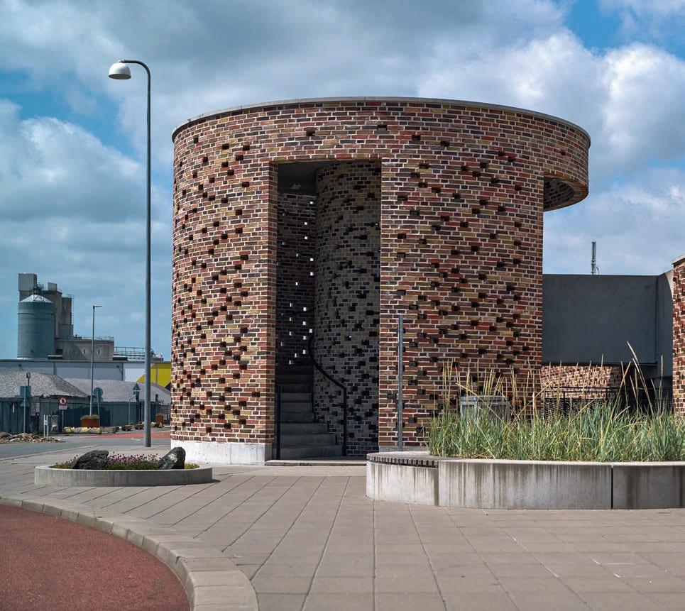
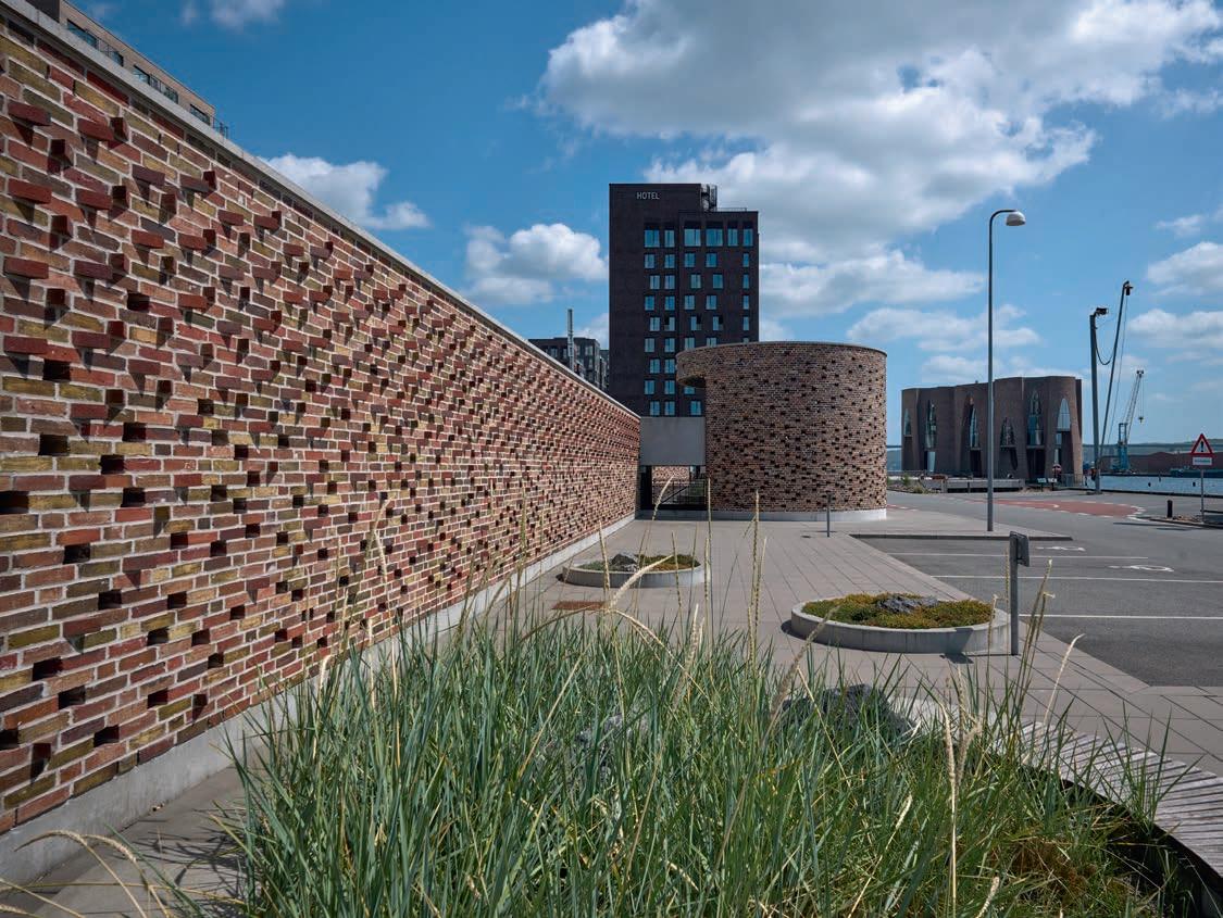
A key decision was to use the surplus bricks from Fjordenhus. About 20 pallets, selected by Olafur Eliasson, had been stored and were used for the distinctive rotunda. “The rotunda is built entirely of brick and houses the main staircase. This architectural and functional choice not only simplifies orientation but also allows the staircase to serve as a sculptural focal point at the centre of the façade,” says project architect Nicola Laursen-Schmidt.
Like the stairwell in Fjordenhus, the interior of the rotunda features a mixture of bricks in cooler colours, while the outer wall is composed of bricks in warmer reddish tones. The bond required great technical precision, as both the radius and the openings for light meant the joints and bonds had to match. The runner bonds in the innermost brickwork were cut at one end so they could follow the two concentric bonds.
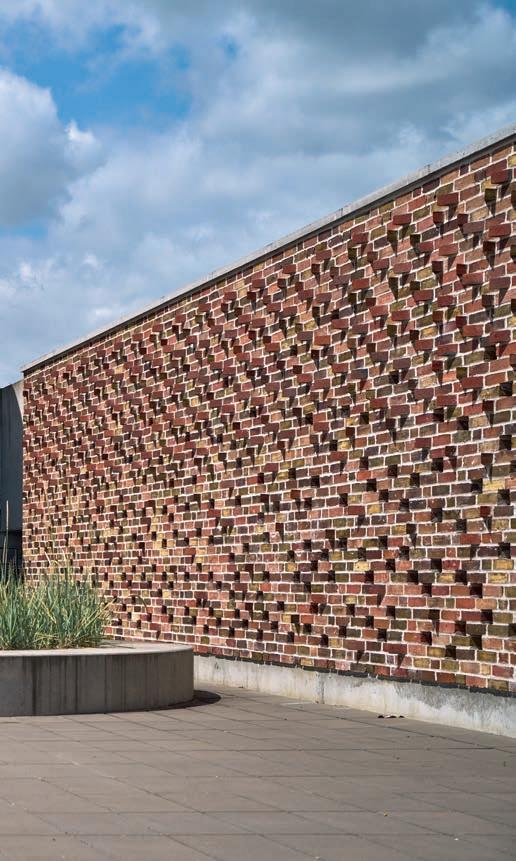
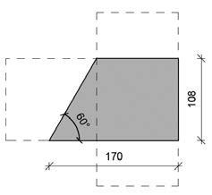
While the rotunda continues the Fjordenhus narrative, the long façade is a separate architectural statement. Here, the architects deployed a new mixture of bricks in warm colours from the Petersen range. “The play of light on the water in the harbour basin was our original inspiration for the façade. We replaced approximately two-thirds of the headers at a 60° angle and glazed a third of them at the brickworks. During the day, the cut bricks cast shadows while the glazed bricks reflect sunlight, just like water.”
To ensure the desired interplay between light and glaze, a mock-up was erected at the brickworks in Broager to assess the combination of colours, reflection and cavity wall. The result is a vibrant façade with an almost maritime feel.
The matte and glazed bricks were delivered from the brickworks in mixed stacks on pallets, which allowed the bricklayers to choose directly from the piles, creating a random pattern.
RAVN Arkitektur has designed parking facilities before, but the project in Vejle was unusual. “Designing a building that is 120 metres long and just three metres high was an entertaining exercise, and the façade became all-important,” explains Nicola Laursen-Schmidt
“Although the building has a straightforward function, the brickwork was technically ambitious. Our master bricklayer particularly enjoyed building the stair turret. The brickwork and the craftsmanship involved have been elevated to an artistic level – almost like following a knitting pattern at a 1:1 scale!”
Parking at Havneøen, Vejle, Denmark
Client: Kirk Kapital
Architect: RAVN Arkitektur
Contractor and masons: K.G. Hansen & Sønner
Engineer: Hundsbæk & Henriksen
Built: 2021
Brick, stairwell, exterior wall: D33, D34, D35, D36, D37, D38, D42, D43, D46, D49
Brick, stairwell, interior wall: D47, D48, D49, D73, D91, D99
English bond, runner bonds supplied pre-cut by the brickworks.
Brick, main façades: D43, D46, D47 DNF, a mixture of one-third of each brick.
Munk bond 2. Thirteen thousand bricks were custom-made without a frog and cut at the brickworks at a 60-degree angle, placed with the tip outward.

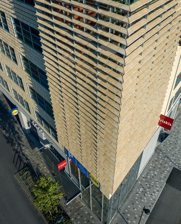
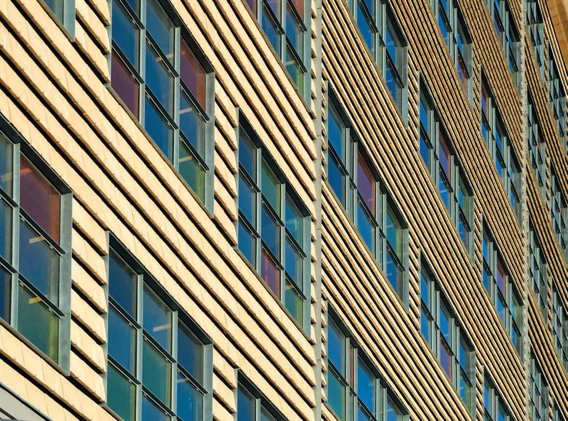
THE TENGBOM DESIGN STUDIO USED HANDMADE BRICKS IN VARIOUS FORMATS AND WITH DIFFERENT FUNCTIONS TO CREATE A HOMOGENOUS AND VIBRANT MULTI-STOREY CAR PARK.
By Ida Præstegaard, MA in Architecture | Photos: Ulf Celander
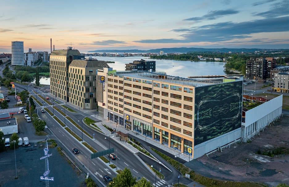
Jönköping stands on the southern shore of Lake Vättern in southern Sweden. A couple of kilometres from the city centre on the approach from the south stands a new multi-storey car park, which breaks the traditional mould.
Spanning 18,000 m2, it is intended as a landmark and gateway to the new Skeppsbron district. In addition to the 600 parking spaces, it houses a supermarket and a fitness centre.
The architects, Magnus Almung and Fritz Olausson of the Tengbom design studio, managed the project from the initial volume studies through the local authority planning process in 2016, to the detailed planning and supervision of the building work until completion.
“The lengthy preparatory work allowed us to clarify our vision: a building on a human scale with the façade divided into smaller units, so the building didn’t end up being a single overwhelming mass. We wanted to exude an urban sensibility coupled with quality and add more than just a new function to the district,” explains Almung.
Unlike typical multi-storey car parks, which tend to be monotonous and anonymous, this is made with natural materials and an architectural idiom that enhances its surroundings.
Facing the street, the building is divided into four units with slightly different looks, partly due to the geometry of the windows on the upper floors, which vary in size and are not in a horizontal line. The ground-floor sections are of varying heights and coloured renderings to highlight the sense that there are several buildings, despite the single function. Large glass panels facing the street link the commercial units with the public space. The building is set into the ground on a plinth of rough-hewn Swedish Bohuslän granite.
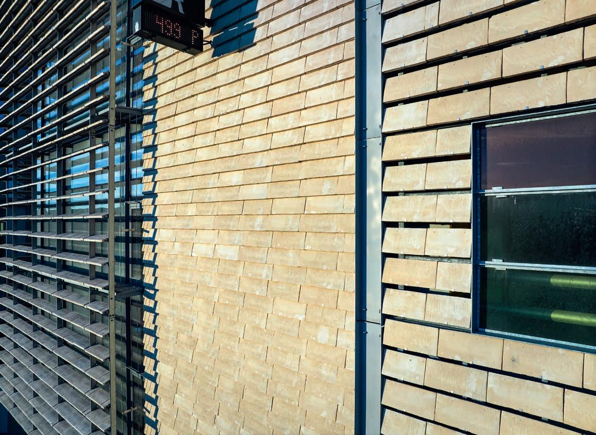
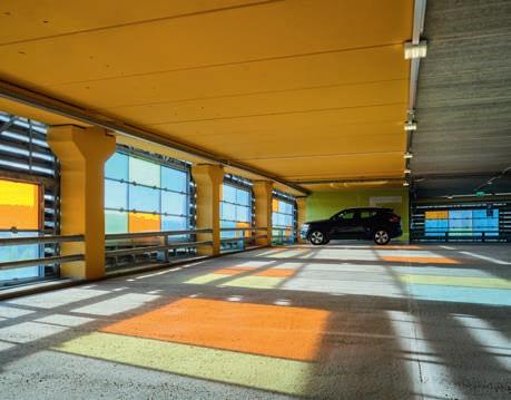
The choice of Cover for the façades was a key decision. “We considered combining multiple shades of Cover on the façades, but because it’s available in various sizes, we decided it would be more subtle to use a single colour instead and vary the format and the way they’re mounted. The façade sections alternate between 528 x 240 x 37 mm and 528 x 170 x 37 mm, resulting in a homogeneous surface that exudes depth and has a lively rhythm. We thought C71’s yellow hues were beautiful, and the brick feels particularly urban when the sun shines on it,” he adds.
“The façades on the car parking floors consist of Cover mounted on a structure specially designed for the project. The bricks are spaced to allow for natural ventilation, ensuring adequate airflow and avoiding dark openings in the façade.”
The tower on the northwest corner of the building houses the main staircase and lift, and is clad in 528 x 170 x 37 mm Cover.
“The brick on the tower is mounted on a steel structure attached to insulated prefabricated concrete elements, which makes it look more substantial and highlights that the tower is the vertical focal point.”
The tower has large glass sections that wrap around the corner, offering views both in and out for people waiting for the elevator or using the stairs.
“For this part of the building, we used Cover 528 x 240 x 37 mm mounted in front of the windows as permanent sunshades, a solution that elegantly combines functionality and aesthetics: the bricks cut down on the direct sunlight but generate a significant play of light and shadow across the façade.”
To comply with the legal requirements for natural ventilation for exhaust fumes and the fire regulations, the overall façade needed to be open to a certain degree. The solution was to clad the rear wall facing the yard with ventilated expanded metal. A kindergarten uses the yard as a playground, which is why the façade at the ground-floor level is built to withstand snowball fights and all sorts of games, but also to radiate care and warmth. Made of D48, with its rustic surface and warm, red-brown hues, it matched the architects’ ambitions.
The new building in Jönköping demonstrates how an ordinary multi-storey car park can be elevated into a prominent urban resource. Using the same handmade brick in three distinct ways establishes a unique balance between variety and homogeneity. The bricks add a vibrant texture and will age gracefully.
Client: Jönköping Kommuns Fastighetsutveckling AB, Nedo Sever
Architect: Tengbom, lead architects Magnus Almung and Fritz Olausson
Contractor: Gärahovs Bygg AB
Built: 2023
Brick: C71, 528 x 170 x 37 mm, C71 528 x 240 x 37 mm and D48 FF
“For us, brick serves not as a nostalgic throwback but as a means to instil continuity. And in Dubai, this represents perhaps the most radical gesture: building something that will last.”
Architect Sangeeta Merchant
DUBAI, IN THE UNITED ARAB EMIRATES, IS OFTEN ASSOCIATED WITH GLASS AND STEEL BUILDINGS, WHERE MONUMENTALITY AND SPECTACULAR STAGING ARE THE PRIORITY. A NEW HOUSING DEVELOPMENT PRESENTS A SIGNIFICANT CONTRAST: IT SEEKS TO LAST, NOT TO IMPRESS.
By Ida Præstegaard, MA in Architecture | Photos: Javier Callejas Sevilla
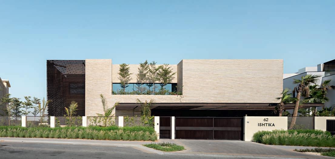
An Indian family, familiar with SPASM Designs’ work in Ahmedabad in the Indian state of Gujarat, approached the architects to design their new home in Dubai.
Architects Sanjeev Panjabi and Sangeeta Merchant, the founders of SPASM Design, explained that the couple didn’t aspire to formal grandeur. They had a deep-seated desire for a functional home that was embedded in and sensitively attuned to its surroundings. They chose brick as the material because it responds to the climate and adds a human scale, specifically D71 and K71, whose golden and whitish hues harmonise beautifully with the colours of the desert.
Focusing on the climate was a given. Due to the extremely hot and dry conditions, the Persian Gulf desert is traditionally perceived as a challenging place to live, and air conditioning is usually considered essential. SPASM Design decided to treat the desert as an ally instead, creating a microclimate that passively utilised shade, airflow and texture to address the heat challenge.
The façade is in layers: an outer one made of brick that reduces heat absorption due to its mass and porosity, followed by an air-filled
cavity that serves as a buffer, and finally, the inner layer of thermal insulated blocks. The result is a robust building envelope that reduces the need for air conditioning by more than 20%.
“The decision to use D71 was influenced not just by technical factors but also by architectural considerations. In contrast to Dubai’s glass-and-steel surfaces, the water-struck bricks have a unique structure and subtle colour variations. Their intrinsic texture is highlighted and changes as the sun moves across the brick façades. To add variation, our team and the client chose different formats in matching shades. The brickwork on the front is a combination of K71 and D71 in Flensburg format. In the courtyard, we used D71 DNF and went for the Flensburg format on the other façades,” explains Sanjeev Panjabi.
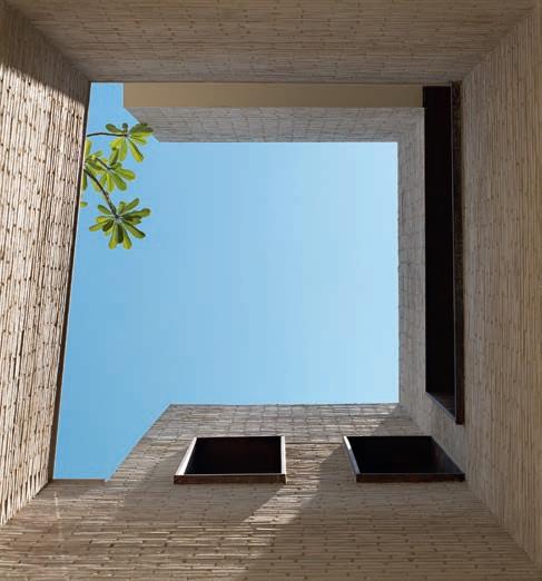
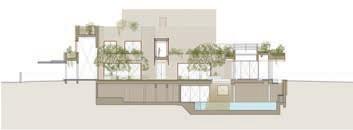
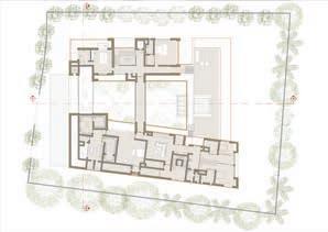
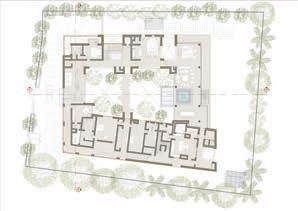
The 2,521 m2 house consists of four wings formed from simple, intersecting, cubic volumes. Three of them are two storeys high, while the fourth, which faces a golf course, is a single storey. The spacious courtyard is key to the home’s functionality. It serves as its green lung, offering shade and coolness. A glass walkway at first-floor height crosses the courtyard and, like parts of the façade, is clad with Corten

The façades form a layered envelope that reduces the need for air conditioning by more than 20%.
An outer brick layer limits heat transfer into the building due to its mass and porosity, while an inner layer of thermoblocks, required in Dubai, provides thermal insulation. Between them, a 100 mm ventilated cavity allows air to heat up, rise and escape through slots in the Corten coping. This passive ventilation minimises heat loss and helps keep the house cool.
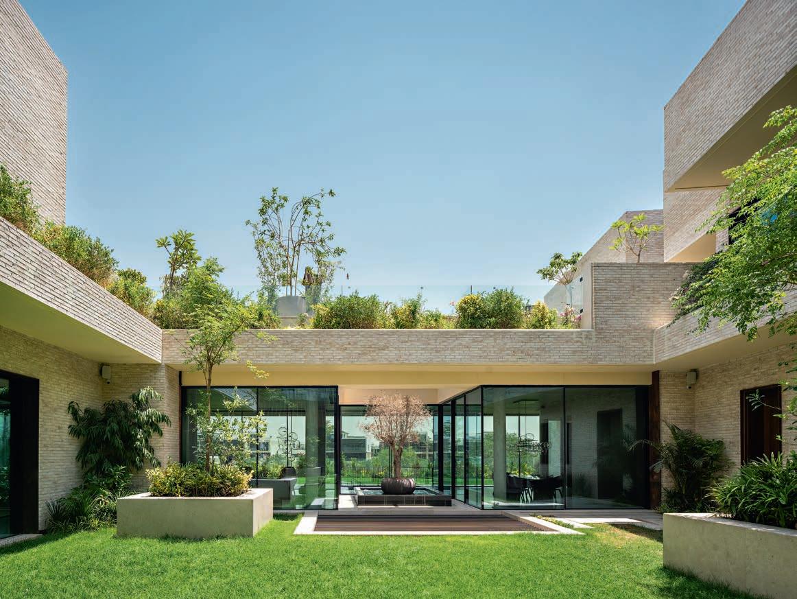
steel jaalis that filter light and dust. The roof planting and quiet, rippling pools of water serve as additional cooling and decorative elements.
The finished house is a far cry from Dubai’s characteristic ambition of attracting attention. Instead, it radiates a discreet dignity, the architecture acting as a framework for everyday life rather than overwhelming it.
“In this home, a child can grow up with sand beneath their feet, the sky above their head, and materials that are pleasant to touch all around them,” as Sangeeta Merchant puts it.
“In a city where people often build to impress, this house stands as a reminder that an alternative approach is possible. For us, brick serves not as a nostalgic throwback but as a means to instil continuity. And in Dubai, this represents perhaps the most radical gesture: building something that will last.”
Villa in Dubai Hills, Dubai, The United Arab Emirates
Client: Private
Architect: SPASM Design Architects
Landscape architect: Golden Seed Landscaping & Gardening Works
Main contractor: Mastery Building Contracting LLC
Engineer: Chawla Architectural & Consulting Engineers
Masonry contractor / Brick layers: LBTB Building Contracting LLC
Completed: 2025
Bricks, front façade: K71 and D71FF (25/75%)
Bricks, courtyard façade: D71 DNF
Bricks, other façades: D71 FF
Accommodation for temporary staff, Wilhelmshaven, Germany
Client and architect: JAP Architekten by Ulf Janssen Architekt BDA
Contractor and landscape architect: puro
Engineer: TGA Ingenieurbüro Reinhold Schnieders, IGT
Completed: 2024
Mix
Brick takes centre stage in the communal entrance. On closer inspection, the varied formats stand out from the otherwise almost monochrome surface.
Facing the residential street, the buildings look like precisely composed monoliths with formal façades and a tightly composed front garden.
On the
a
GREY BRICK VOLUMES COMBINE TO FORM A NEW RESIDENCE FOR TEMPORARY STAFF WORKING FOR AN ARCHITECTURAL COMPANY IN THE PORT CITY OF WILHELMSHAVEN, 220 KM WEST OF HAMBURG. THE BRICKWORK’S PRONOUNCED HORIZONTAL ORIENTATION IS REMINISCENT OF A SOLID BLOCK OF SLATE.
By Morten Birk Jørgensen, architect MAA, associate professor, PhD | Photos: Paul Kozlowski
It can be a challenge for an ambitious studio outside of the big urban centres to attract people with the right qualifications, especially for short-term, project-specific roles. In order to meet this need, JAP Architects in Wilhelmshaven on the German coast of the North Sea, has built its own accommodation for temporary staff. The new block is adjacent to an existing complex consisting of the actual studio, the owner’s home and an apartment for visiting clients. The new block is the focal point of this article.
JAP Campus is located in a quiet residential area on the outskirts of the city. Its six new apartments are housed in a separate block facing the road, while the remainder of the complex faces the park to the south and is accessed via driveways.
In contrast to the more discreet homes along the road, the new addition has a more formal and professional air. Its solid volumes, dotted with only a few square openings facing the road, stand behind a solid wrought iron gate. Looking at it, nobody is left in any doubt that an architect designed the new addition.
The new volumes are clad in grey brick – a mix of headers in Danish standard format and thinner, more elongated Kolumba. While stretchers dominate the bond, the variation in brick sizes means that the façade avoids the more obvious patterns seen in classic bonds. Here, the guiding principle is stratification, with horizontal brickwork that evokes a massive block of slate. The geological effect partly stems from a feature not immediately obvious from a distance – many of the Kolumba bricks in the façade are threaded with irregular cracks, as discarded bricks were an intentional and integral part of the design.
Ulf Janssen, architect and owner of JAP Architects, has worked with Petersen Tegl on several projects. During a visit to the brickworks in Broager, he came across a pile of discarded bricks and was inspired to integrate them into the design of the temporary accommodation. What emerges from the combination of the randomly damaged, uneven Kolumba and the regular bricks in Danish standard format is a pattern that is at once disciplined and disorganised.
The meticulously architectural approach continues behind the imposing iron gate, with brick paving spanning the spaces between the apartments. The doors are set in deep niches that add to the solid, stratified effect of the brickwork. By contrast, the windows are flush with the façade, and all of them – from the small windows in the bathroom to the large glazed walls – are square. The overall aesthetic is stylishly severe and executed with precision. Inside, the apartments have a different atmosphere, emphasising luxury and pleasure. Janssen’s background in interior design is reflected in his absolute attention to detail, a rare quality in interiors designed by architects. Each individual element is a small world unto itself, in which the material potential is fully realised. The fixtures and fittings take you on a grand tour of inspired design, with a distinct emphasis on the modern and Scandinavian.
A finely composed roof terrace offers views of other homes in the area and the nearby park. The new extension to the campus is a highly professional addition to the neighbourhood in Wilhelmshaven, in terms of both the architecture and its purpose. Diligent, yes – but also fashionable.
UNDER THE CROWNS OF TALL, OLD BEECH TREES STANDS A VILLA THAT PROVIDES THE SETTING FOR A LIFE CLOSE TO NATURE. LARGE WINDOWS DRAW ALL THE SURROUNDING GREENERY INTO THE HOME, WHILE THE GREY-GOLDEN WALLS CAPTURE THE SHADOW PLAY OF THE PLANTS.
By Martin Søberg, PhD, architectural historian
Photos: Luuk Kramer
The Leie River winds its way around the village of Sint-MartensLatem, south-west of Ghent, and then through extensive wet grasslands known as Latemse Meersen. The area is a nature reserve, home to a diverse range of flora and fauna, including deer, foxes, several species of bat and various members of the marten family. Here and there, avenues of slender poplars border the flower-rich meadows. From around 1900 until the Second World War, the picturesque landscapes around Sint-Martens-Latem attracted artists, who settled in the village and formed a colony. A wealthy bourgeoisie also took up residence in the scenic surroundings, and the area has since become one of the most desirable places to live in Belgium.
The villa is on a plot carved out from the large gardens of an older home. The access road resembles an avenue flanked by beech trees, and the site is home to ten big beeches. Along with the site’s irregular shape, the trees helped determine the villa’s position. The elongated plot is widest towards the road and narrows towards the opposite end, where it meets the Latemse Meersen nature reserve. Belts of planting skirt the neighbouring plots, so that the villa stands in a kind of clearing that begins at the road and stretches all the way to the wet grasslands.
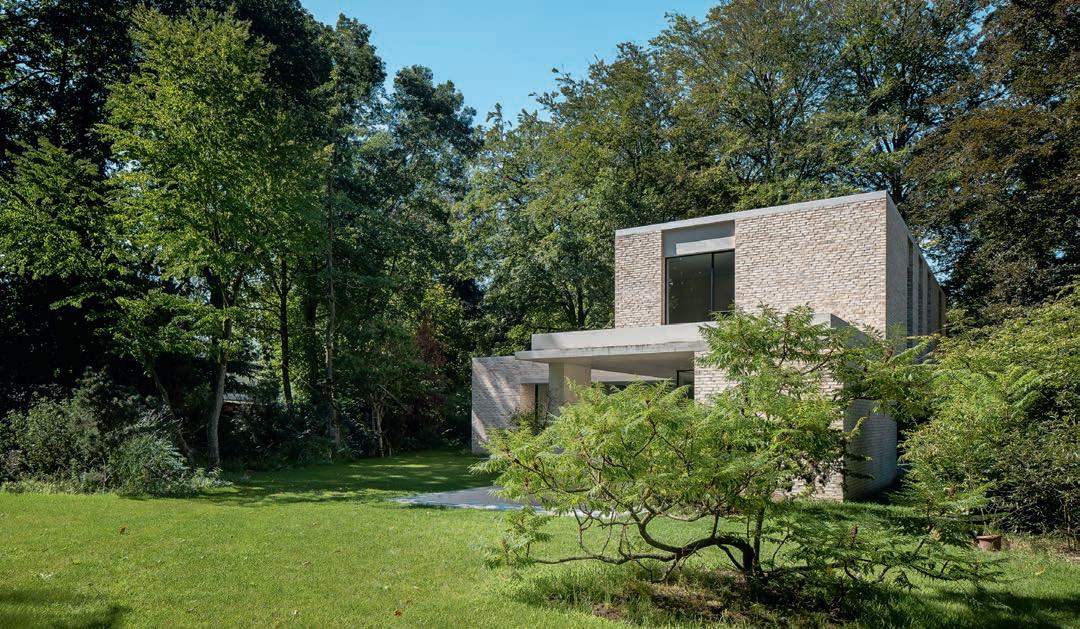
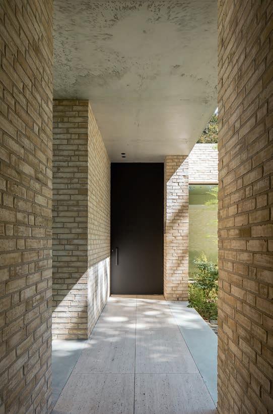
Upon arrival, the villa looks like an asymmetrical composition of three offset volumes in different sizes. The carport is the smallest of the three, while the home itself consists of two joined sections – of one and two storeys, respectively – forming a T-shaped footprint.
“The three volumes are simple elements, but the composition endows the villa with complexity. You don’t see the whole building right away. You have to move around and through it first. It piques the curiosity,” says architect Mattias Verschueren of Element Architecten.
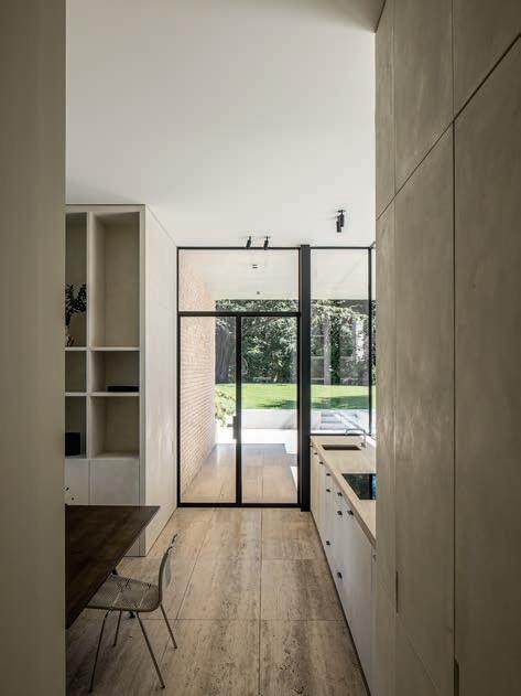
The volumes form a small courtyard that you pass on the way to the front door, and a canopy connects the home to the carport. Inside, the ground floor includes dining and living rooms, a kitchen and a study. The first floor is more private and houses three bedrooms, the largest of which has access to a large terrace. The living rooms and kitchen also open onto terraces. The kitchen and its terrace are both three steps below ground level, which creates an intimate atmosphere inside and reinforces the feeling of being immersed in the middle of all the surrounding greenery.
The buildings are made of in-situ cast concrete with exterior walls in light, grey-golden brick. Here and there, the
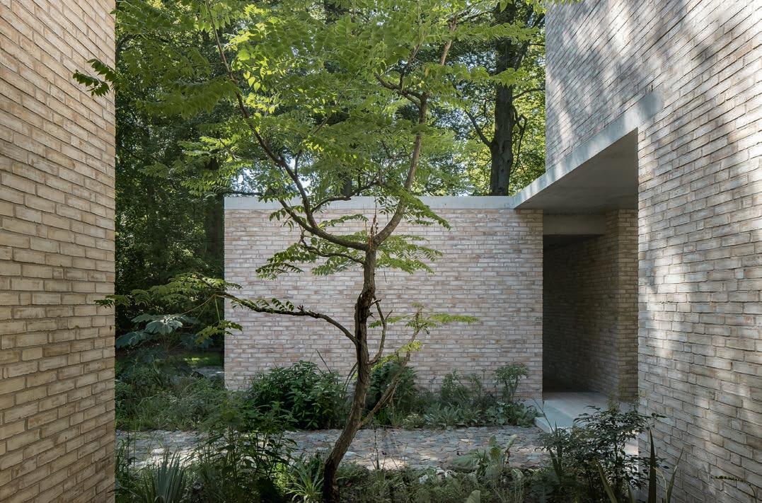
The light grey-gold bricks give the buildings added warmth and texture. The bricks’ colour tones subtly interact with the light grey concrete.
concrete is exposed – for example, on the fascia boards and panel walls – while the dark steel window frames contrast with the light tones of the brickwork and concrete. Flat roofs emphasise the volumes’ cubic forms. Indoors and on the terraces, the floors are tiled in travertine, and the same material is used to cover some of the interior walls. The doors are made of dark walnut.
“We wanted to use materials that would imbue the building with a unique identity, including through the colour of the bricks. That’s why we chose Petersen Tegl. They were able to offer exactly the right colour, which wasn’t available anywhere else. D71’s subdued and varied tones interact with the colours of the plants and trees in the garden. The shadows cast by the plants across the façade are magnificent and change throughout the day. And the bricks reflect the light in an exceptionally captivating way. Inside and out, architecture and nature complement each other. The villa forms a simple framework for a tranquil existence in harmony with the other forms of life that surround us,” Verschueren explains.
Family home, Sint-Martens-Latem, Belgium
Client: Private
Architect: Element Architecten
Main contractor: G-Build, Lootens, Devaere
Engineer: Sileghem & Partners
Built: 2018
Brick: D71 DNF
“Petersen Tegl was able to deliver exactly the right colour brick with subdued and varied tones interacting with the colours of the plants and trees in the garden.”
Mattias Verschueren, architect
ORIGINALLY A TOY MADE FOR CHRISTIAN A. PETERSEN’S GRANDCHILDREN, PETERSEN TEGL’S JUNIOR BRICKS QUICKLY PROVED THEIR VERSATILITY. MOST RECENTLY, THEY HAVE BECOME PART OF A COLLABORATION WITH DINESEN.
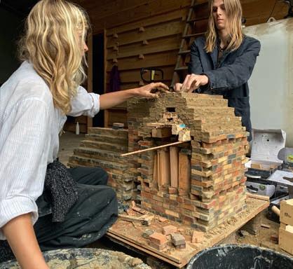
Brick has once again taken centre stage on an old farmyard in Vrå, Southern Jutland, Denmark. Not standard industrial brick, but handmade creations that tell stories of landscape, craftsmanship, and community. The farm is home to ORBI, an association that has created a living laboratory where architecture emerges from encounters between tradition and innovation.
ORBI is the result of a partnership that began in 2019 between the wood flooring company Dinesen and the Royal Danish Academy, Institute of Architecture and Culture. It runs summer schools for architecture students on the farm, which also serves as an informal gathering place and workshop space for architects, artists, agronomists, farmers and other groups.
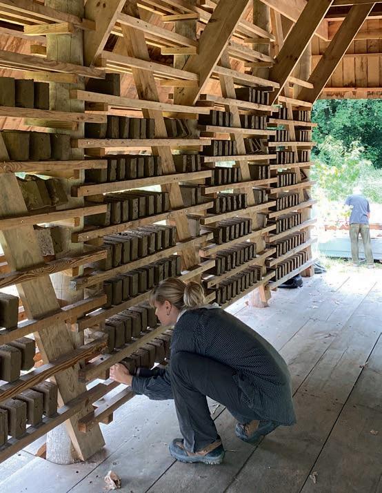
Bricks used to be produced here about two centuries ago, including the ones used for the farmhouse. Last year, the summer school revived that tradition and resumed the production of handmade bricks for its future projects.
In 2025, the students visited the special exhibition Well-Tempered: For a ClimateSuitable Architecture! at ‘the Molfsee Open-Air Museum,’ Schleswig-Holstein, where the focus was on traditional building culture and historical methods of domestic heating.
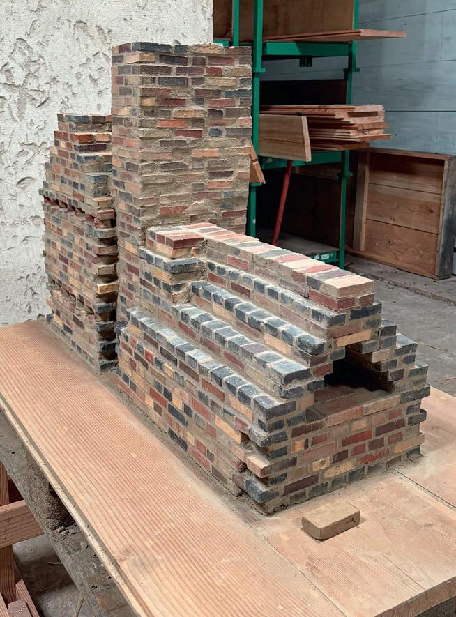
The exhibition sparked an exploration of older techniques, leading the students to construct a masonry oven at a scale of 1:3. They also plan to build a full-scale version at the farm to act as both a fireplace and a baking oven. Petersen Tegl was involved in the project, providing various colours of Junior bricks for the miniature masonry heater, which was completed in July.
CONSULTANTS–PETERSEN TEGL DENMARK EAST ARNE GOTFREDSEN P: +45 2967 7030 E: AGO@PETERSEN-TEGL.DK
DENMARK WEST AND FUNEN TORBEN SCHMIDT P: +45 2028 4355 E: TSC@PETERSEN-TEGL.DK
EXPORT MANAGER STIG H. SØRENSEN P: +45 4014 1236 E: SHS@PETERSEN-TEGL.DK
NORWAY MUR DIREKTE AS SIMEN BØE P: +47 2339 2010 E: POST@MURDIREKTE.NO
SWEDEN TEGELMÄSTER AB CATHARINA HOLMSTRÖM P: +46 40 542 200 E: INFO@TEGELMASTER.SE
GERMANY SCHLESWIG-HOLSTEIN, HAMBURG JUTTA ENGLER P: +49 171 7561 943 E: ENGLER@PETERSEN-TEGL.DK
GERMANY EAST, BERLIN, NIEDERSACHSEN, BREMEN ERIC SCHMIDT-BANDUR P: +49 174 3800 667 E: ESB@PETERSEN-TEGL.DK
GERMANY SOUTH/NORTH RHINE-WESTPHALIA SWITZERLAND (GERMAN-SPEAKING REGION) AUSTRIA BACKSTEIN-KONTOR GMBH P: +49 221 888785-0 F: +49 221 888785-10 E: INFO@BACKSTEIN-KONTOR.DE
BENELUX PETERSEN BENELUX BELGIUM, LUXEMBOURG BJÖRN LUCASSEN P: +31 (0) 652362168 E: BLU@PETERSEN-TEGL.DK
NETHERLANDS LINEKE LUCASSEN P: +31 (0) 622529266 E: LLU@PETERSEN-TEGL.DK
TOM LUCASSEN P: +31 (0) 646236445 E: TLU@PETERSEN-TEGL.DK
LARS HOGEBOOM P: +31 (0) 625391583 E: LHO@PETERSEN-TEGL.DK
UNITED KINGDOM STIG H. SØRENSEN P: +45 4014 1236 E: SHS@PETERSEN-TEGL.DK
EUROPEAN BUILDING MATERIALS LIMITED P: +44 (0) 203 805 0920 E: ENQUIRIES@EBMSUPPLIES.COM
POLAND CENTRUM KLINKIERU SCHÜTZ P: +48 58 56 37 201 E: BIURO@CENTRUM-KLINKIERU.PL
EASTERN EUROPE (EX POLAND), ITALY INGRID KATHRIN GROKE P: +45 2047 9540 E: IKG@PETERSEN-TEGL.DK
UKRAINE INGRID KATHRIN GROKE P: +45 2047 9540 E: IKG@PETERSEN-TEGL.DK
VISTARK KLINKER P: +380 44 221 47 37 E: VISTARK.KLINKER@GMAIL.COM
AUSTRALIA AND NEW ZEALAND ROBERTSON’S BUILDING PRODUCTS PTY LTD P: +61 3 8199-9599 E: PETER@ROBERTSONS.CO
INDIA AND MIDDLE EAST ATLAS DEVELOPMENTS INDIA P: +31642552517 E: ISHANVIR@ATLASDEVELOPMENTS.NL
SOUTH AMERICA INGRID KATHRIN GROKE P: +45 2047 9540 E: IKG@PETERSEN-TEGL.DK
DESIGN AND LINTELS STEEN SPANG HANSEN P: +45 2142 7962 E: SSH@PETERSEN-TEGL.DK
PUBLISHER
PETERSEN TEGL A/S NYBØLNORVEJ 14 DK-6310 BROAGER P: +45 7444 1236 E: INFO@PETERSEN-TEGL.DK WWW.PETERSEN-TEGL.DK
EDITORS IDA PRÆSTEGAARD, MA IN ARCHITECTURE E: IPR@PETERSEN-TEGL.DK
ANNETTE PETERSEN, MA IN ARCHITECTURE E: AP@PETERSEN-TEGL.DK
LAYOUT ZANGENBERG DESIGN
TRANSLATION CITADEL TRANSLATIONS
STRANDBYGAARD
REPRO EHRHORN HUMMERSTON
PRINT RUN 161,375
’Urbi et Orbi’ has been a phrase in the papal blessing of Rome since the 13th century, meaning ’for the city and for the world’ – it can be translated as ’everywhere and anywhere.’